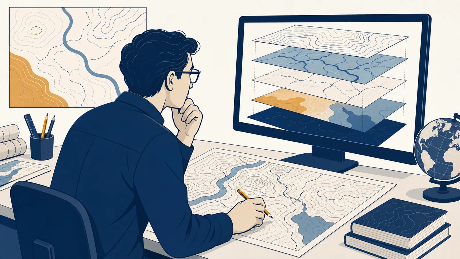
Cartography is the discipline that designs, makes, and interprets maps to communicate spatial information in the context of geography. A clear cartography definition includes both the science of measuring location and the craft of choosing what a map shows. Cartographers turn coordinates, observations, and geographic data into symbols that people can compare. The basic purpose of cartography is to make patterns, positions, routes, and relationships visible when the real world is too large, complex, or distant to inspect directly.
A map is therefore a model, not a miniature copy of Earth. It leaves most things out, changes the size of everything, and often changes shape or direction as well. Those changes are useful when they are controlled and explained. A subway map can straighten a winding railway because passengers need station order more than exact curves. A land survey cannot take the same liberty because a boundary may depend on metres and angles.
Every map makes an argument. Selection, scale, projection, symbols, and labels direct attention toward some facts and away from others, even when the underlying data are accurate.
What cartography actually is
Cartography is the complete process of turning spatial evidence into a readable map: deciding the map's purpose, gathering and checking data, choosing a scale and projection, designing symbols, arranging labels, and testing what a reader is likely to understand.
The word map can mean the finished object, while cartography names the thinking and work behind it. That work combines measurement, visual design, statistics, computing, and geographic judgment. A paper road atlas, a weather map on television, a globe, and a phone's route display are all cartographic products, although each solves a different problem.
Three elements are present in almost every map. First is a spatial frame, such as latitude and longitude, a street grid, or the floor plan of a building. Second is encoded information, shown with points, lines, areas, colours, or text. Third is supporting information, which may include a title, legend, scale bar, north arrow, date, source, and notes about uncertainty.
This view treats the map as a direct image of a place. It hides the decisions that produced the image and encourages the reader to accept every edge and colour as natural.
This view asks what was measured, what was omitted, how positions were transformed, and what the symbols mean. It treats the map as evidence that must be read.
Cartography is also different from simply drawing. A hand drawn sketch can be an effective map if it preserves the relationships needed for a task. A beautiful image can fail as a map if its symbols are ambiguous or its locations are wrong. The standard is not decoration. The standard is whether the design communicates the intended spatial facts honestly and efficiently.
How a map turns a place into marks
A map is made by defining a question, collecting location based data, reducing detail to suit the scale, transforming positions onto a flat or digital surface, encoding selected facts with symbols, and checking the result against its intended use.
A useful map answers a specific question for a specific audience. “Find the nearest open clinic” requires opening hours and routes. “Compare regional access to clinics” requires coverage and population data instead.
Positions may come from ground surveys, satellite receivers, censuses, sensors, official records, or images. Each source has a date, resolution, method, and margin of error.
The cartographer keeps details relevant to the purpose and generalizes the rest. A national road map keeps motorways but may omit alleys, driveways, and small bends.
Coordinates are placed in a coordinate reference system. For a flat map, a projection supplies rules for converting positions on Earth to positions on the page or screen.
Symbols, colours, line weights, type sizes, and spacing establish a visual order. Important features should be found quickly without hiding relevant context.
The maker checks data, spelling, units, legends, colour contrast, crowded labels, and likely misreadings. Test readers can reveal problems that the maker has learned to overlook.
The chain matters because an error early in the process survives attractive design. If an old road record lists a bridge that has closed, crisp symbols will communicate the wrong route more persuasively. The cartographer must keep the distinction between data quality, meaning the fitness of the observations, and design quality, meaning the fitness of their display.
Generalization is the least visible step and one of the most important. On a smaller map, two nearby buildings may collapse into one block, a jagged coast may become a simpler line, and a minor stream may disappear. The aim is to preserve useful structure while preventing marks from colliding. Simplification is not automatically deception. It becomes misleading when removed detail changes the answer to the map's question.
This pipeline also explains how errors travel. An uncertain observation can become a precise looking coordinate, then a sharp boundary, then a confident decision. Good maps keep uncertainty visible through notes, ranges, faded edges, alternative scenarios, or an explicit statement that the data do not support a fine boundary.
How coordinates give every feature an address
Coordinates locate a feature by measuring its position within a defined reference system. Latitude and longitude use angles on an Earth model, while projected coordinates use flat grid distances, usually so mapping, measurement, and calculation are easier within a chosen area.
Latitude measures angular position north or south of the equator. Longitude measures angular position east or west of the prime meridian. A coordinate pair is incomplete without its reference datum, the mathematical model that sets Earth's size, shape, and origin. The same physical point can receive slightly different numerical coordinates under different datums.
A projected coordinate system converts curved surface positions into eastings and northings on a plane. These values can be handled like coordinates on graph paper within the limits of that projection. Surveyors and engineers often prefer such grids because distances in metres are more convenient than angular differences in degrees.
A rescue team receives a coordinate but not its datum or coordinate format. One person reads degrees and decimal minutes while another assumes decimal degrees. Both values look plausible, yet they identify different points. Repeating the format and reference system is part of communicating the location.
Satellite receivers estimate their position from timed radio signals. The map on a phone then matches that calculated position to a road or path database. This process, called map matching, can place a slightly uncertain position onto the most likely route. The underlying positioning mechanism is covered in how satellite navigation calculates location.
Coordinates describe position, but they do not by themselves describe meaning. The pair attached to a point might represent a tree trunk, a property corner, a bus stop sign, or the centre selected for a whole town. Metadata must explain what the feature is, who recorded it, when it was recorded, and how precisely.
What map scale actually controls
Map scale is the ratio between a distance on a map and the corresponding distance on the ground. It controls how much area fits, how much detail can remain legible, and which measurements can reasonably be made from the map.
A representative fraction such as 1:50,000 means one unit on the map equals 50,000 of the same units on the ground. The units cancel, so 1 centimetre on the map represents 50,000 centimetres, which is 500 metres. The same ratio also means 1 inch represents 50,000 inches, though the converted ground unit will differ.
At 1:50,000, a 6 cm map distance represents cm, or 3 km, before adjustments for a winding route or measurement error.
A large scale map shows a smaller area with more detail, as if the mapped features were drawn larger. A 1:5,000 neighbourhood plan is larger scale than a 1:5,000,000 continental map because is the larger fraction. The terminology feels backward until scale is treated as a fraction rather than an area.
| Scale form | What it communicates | Main limitation |
|---|---|---|
| Representative fraction | A precise unitless ratio, such as 1:25,000 | Readers must convert it into useful ground units |
| Written statement | A direct relation, such as 1 cm represents 250 m | It becomes wrong if the map is enlarged or reduced |
| Graphic scale bar | A line marked with ground distances | Accurate reading is limited by printing and screen resolution |
A scale bar changes size with a copied or resized map, so its relationship to the map usually survives. A written ratio does not automatically update. Digital maps complicate scale because the display changes with zoom level and screen size. They often show a scale bar that recalculates as the view changes.
Scale also limits truth. A line printed half a millimetre wide on a 1:50,000 map represents 25 metres on the ground. That line cannot show a narrow boundary with centimetre precision, even if the coordinate database stores many decimal places. Display precision and data precision are different.
How projections flatten a curved Earth
A map projection is a mathematical transformation that transfers locations from Earth's curved surface to a flat plane. Every world map projection distorts some combination of area, shape, distance, or direction because a curved surface cannot be flattened without stretching or tearing.
Imagine cutting an orange peel and pressing it onto a table. Gaps open, edges bend, or parts stretch. Mathematical projections manage the equivalent problem with defined rules. A projection can preserve one property exactly or approximately for a chosen purpose, but it cannot preserve all spatial properties everywhere.
The Mercator projection is conformal. It was developed for navigation and represents a constant compass bearing as a straight line. Its scale increases toward the poles, so high latitude lands appear much larger relative to equatorial lands than they are. Measuring country size from a Mercator world map therefore gives a bad comparison, even though local angles are useful.
An equal area projection keeps proportional area correct, which makes it suitable for maps comparing forest extent, population territory, or land use. Shapes must distort instead. A projection centred on one city might preserve distances or directions from that city, while distortion grows elsewhere. Projection choice follows purpose, extent, and location.
No flat world map is distortion free. The honest question is not whether distortion exists, but which property is distorted, where the distortion grows, and whether that affects the intended comparison.
Globes avoid the fundamental flattening problem, but they have their own practical limits. A globe shows only part of Earth at once, is difficult to carry at useful sizes, and cannot easily present detailed local information. Cartography chooses a manageable model for the task rather than one universally best representation.
Reference maps versus thematic maps
Reference maps help readers locate many kinds of features, while thematic maps emphasize the spatial pattern of one subject or a small set of related variables. The difference lies in purpose and visual priority, not in whether the map is detailed or digital.
A street map is a reference map because roads, names, landmarks, railways, water, and administrative boundaries help with orientation. A map of average rainfall is thematic because colour or contour values make one measured subject dominant. A base map may sit beneath the theme to provide location without competing with it.
Answers “What is here?” and “Where is it?” It balances multiple feature types and usually supports search, orientation, or travel.
Answers “Where is this condition common?” or “How does this variable change?” It gives one topic a clear visual structure for comparison.
Thematic maps come in distinct forms, and choosing the wrong one can change the apparent story. A choropleth map shades existing areas such as districts according to a normalized value. A proportional symbol map changes symbol size according to a magnitude. A dot density map uses repeated dots to represent counts within areas. An isoline map connects locations with equal values, such as elevation or air pressure.
Raw totals often do not belong in a choropleth map because large or populous districts tend to dominate. Suppose District A has 900 reported cases among 90,000 people and District B has 300 among 10,000. A total count makes A look larger. Rates show 10 cases per 1,000 people in A and 30 per 1,000 in B. The relevant pattern depends on whether the question concerns workload totals or individual risk.
For 300 events in a population of 10,000 and , the rate is per 1,000 people.
The normalization must match the subject. Dividing road crashes by resident population may help answer one question, while dividing by distance driven may help answer another. A thematic map should name its numerator, denominator, time period, and geographic unit.
How symbols and classification shape the message
Cartographic symbols encode geographic differences through position, size, shape, value, texture, orientation, and colour. Classification groups numerical observations into ranges, so both the symbol system and the class boundaries determine which similarities and contrasts a reader sees first.
Points commonly represent locations too small to draw at the map's scale, such as wells or stations. Lines represent connected or linear features, such as roads and rivers. Areas represent extents, such as lakes or voting districts. A symbol can also be conceptual: an arrow may show migration flow rather than a physical object with that width.
Visual variables should match the data. Different shapes or hues work well for categories such as land use types. A light to dark sequence works for ordered quantities. Symbol area can show magnitude if the cartographer scales the area rather than the diameter. If a circle's diameter is doubled, its area becomes four times as large, so careless scaling exaggerates the value.
To show a value four times larger by area, double the radius because .
Classification turns continuous values into bins such as 0 to 10, more than 10 to 20, and more than 20. Equal intervals use ranges of the same width. Quantiles put roughly the same number of areas into each class. Natural breaks seek clusters and gaps in the dataset. Each method can produce a different looking map from the same values.
Consider values 2, 3, 4, 5, 6, 7, 8, and 40. Equal intervals across the full range place most observations in the lowest class because 40 stretches the range. Quantiles spread the observations across classes but may place very similar values on opposite sides of a boundary. There is no neutral automatic choice. The legend must show the limits so the reader can judge them.
Colour has learned meanings, but these are not universal rules. Blue often suggests water, and a dark sequence often suggests “more.” Red and green may be hard to distinguish for some readers and may carry cultural associations unrelated to the data. Patterns, labels, and lightness differences can prevent colour from carrying the entire message.
Labels are symbols too. Their typeface, size, placement, and orientation establish hierarchy. A country name may span an area, a river name may follow a curve, and a city label may sit beside a point. Good placement makes the connection unambiguous while limiting collisions with other information.
How cartography shows up in real decisions
Cartography turns location data into evidence for travel, emergency response, public health, construction, environmental management, logistics, journalism, elections, and business. In each setting, the map matters because a decision depends on where conditions occur and how places connect.
Emergency teams map access and exposure
Emergency maps combine hazards, people, infrastructure, and time. A flood response map might show predicted water extent, road closures, shelters, hospitals, and neighbourhood population. The layers answer different questions: who may be exposed, which routes remain usable, and where limited crews should go first.
The date of each layer matters. Yesterday's flood outline and last year's road network may conflict with current conditions. Live feeds can help, but their apparent freshness does not guarantee completeness. A broken sensor or blocked report can create an empty area that means “no observation,” not “no hazard.”
Planners compare access, demand, and constraint
A planner considering a new fire station can map travel times, existing coverage, population, land ownership, slope, and likely development. Straight line distance is rarely enough because rivers, one way streets, bridges, and congestion affect actual access. The analysis tests candidate sites; the cartographic display lets officials and residents inspect the tradeoffs.
These layered operations are often performed in how GIS combines and analyzes map layers. Cartography remains necessary after the calculation because a technically correct result can still be unreadable, hide uncertainty, or imply more accuracy than the inputs permit.
Scientists map change that cannot be seen from one viewpoint
Scientists compare mapped observations across time to study coast movement, vegetation, ice, urban growth, or habitat. Images from aircraft and satellites first need geometric correction and interpretation. The methods in using remote sensors to observe Earth explain how measurements of reflected or emitted energy become evidence that can be classified and mapped.
A change map must distinguish real change from differences in sensor, season, cloud, classification method, and resolution. If one image was captured during a wet month and another during a dry month, a colour difference may reflect seasonal vegetation rather than permanent land conversion.
Journalists and citizens inspect public claims
Election maps, disease maps, crime maps, and housing maps compress public data into visible patterns. They can reveal clusters that a table hides, but they can also make land area seem more politically or socially important than the number of people living there. A large rural district may dominate the page while containing fewer voters than one small urban district.
A rental listing says a flat is “ten minutes from the station.” A map lets you test what that means. Measure the walk along legal paths, check barriers and entrances, inspect slope, and note whether the estimate assumes cycling or driving. Location claims become checkable once their route and mode are visible.
Maps also affect money. Insurers examine hazard zones, retailers estimate service areas, delivery companies assign routes, and households compare commuting costs. A boundary drawn for one purpose should not quietly be reused for another. A broad regional flood screening map, for example, may be unsuitable for judging the precise risk at one doorway.
Four mistakes people make with maps
Most serious map reading errors come from treating the display as direct reality: ignoring scale, assuming boundaries are natural and exact, comparing areas without checking the denominator, or trusting precise graphics more than the age and quality of the source data.
1. Reading detail beyond the map's scale
A small scale map cannot settle a fine local question. A regional soil boundary may be based on sampled observations and generalized for display. Enlarging the image makes the pixels or lines bigger, but it does not create new survey evidence. Check the intended scale before using a map for a property level conclusion.
2. Treating boundaries as equally certain
Some boundaries are legally surveyed lines. Others are estimates, zones of transition, or administrative summaries. A sharp line between climate regions may represent a gradual change in temperature and rainfall. The symbol is precise because a display needs an edge, not because nature changes at that exact coordinate.
3. Comparing colour without reading the legend
The same dark shade can mean a large count, a high rate, or a category. Class intervals may be equal or uneven. Two maps can use identical colours for different ranges, so visual similarity does not prove numerical similarity. Read the unit, class limits, time period, and treatment of missing values.
4. Confusing absence with zero
A blank area may mean zero, no data, not applicable, or outside the study. Those states require different symbols. If unreported observations are coloured like zero observations, weak data collection can resemble success. A map should separate measured absence from missing evidence.
Use the margin before the middle. The title, date, legend, source, scale, projection note, and footnotes often determine what the coloured centre actually means.
A disciplined reader asks five practical questions. What is being mapped? Who produced the data and by what method? When do the observations apply? How were values transformed or grouped? What decision is the map fit to support? These questions do not make maps untrustworthy. They make trust proportionate to evidence.
What contour lines actually show
Contour lines connect points of equal value, most commonly equal elevation above a stated vertical reference. Their spacing represents the rate of change across distance: close lines indicate a steep slope, while widely spaced lines indicate a gentler slope.
A contour interval is the vertical difference between neighbouring lines. If one line marks 100 metres and the interval is 20 metres, the next lines mark 120 and 140 metres in the uphill direction. The horizontal distance between them tells how quickly that elevation is gained.
A rise of 60 m over 1,200 m gives , a gradient of 5 percent.
Contours form patterns that describe landform. Closed lines with increasing values inward usually indicate a hill. Where contours cross a stream valley, they commonly form a V shape pointing uphill. Ordinary elevation contours do not cross because one surface point cannot have two elevations, although overhangs and specialized representations need other treatment.
The same isoline idea applies beyond terrain. Isobars connect equal air pressure, isotherms connect equal temperature, and travel time contours connect places reachable within the same duration. Interpolation is involved whenever the exact line falls between sampled observations, so the apparent smoothness may exceed the density of measurement.
How digital maps change without becoming neutral
Digital maps store features and attributes as data, then redraw, filter, query, and update them in response to scale, location, or user input. Interactivity changes what can be shown, but every screen view still depends on cartographic choices and source limits.
Vector data represent points, lines, and polygons using coordinates. Raster data divide space into a grid of cells, with each cell storing a value such as elevation, temperature, or colour. Vector roads can remain crisp while zooming. A raster's visible detail is limited by cell size and the resolution of the original measurement.
Web maps often use tiles, small prebuilt images or data packages loaded for the current view. Different zoom levels receive different tiles. At a national view, a city may be a point and only major roads appear. At a street view, buildings and local names emerge. This is scale dependent generalization happening as part of ordinary interaction.
An algorithm may choose a route by building a network from road segments and junctions, attaching costs such as time or distance, then searching for a low cost path. The result is only as good as the restrictions and costs. A missing gate, temporary closure, unsafe crossing, or wrong speed can make the mathematically best route practically poor.
Personalized maps can centre the user, rank nearby results, or hide irrelevant features. This is convenient, but two people may no longer see the same evidence. Search ranking, paid placement, accessibility settings, travel mode, and location history can affect the display. A screenshot should record the time and settings if it is being used as evidence.
North is not required to be at the top. Many maps use north up because shared orientation helps comparison, but route displays may rotate so the direction of travel points upward. Polar maps and local building plans may use another orientation. The north arrow matters when orientation is not obvious; its presence does not guarantee that every direction or angle is preserved by the projection.
Cartography makes geographic reasoning visible
Cartography connects geographic evidence to human judgment by making location, distance, direction, pattern, connection, and change inspectable. Its value lies in disciplined choices that let a reader see both what the data suggest and what the map cannot establish.
The wider subject asks how physical processes and human activity vary across space, interact across scales, and shape places. See how maps fit into the wider study of places and spatial relationships for the concepts that give mapped patterns their geographic meaning.
A practical way to read any map is to reconstruct its making. Name its purpose. Identify its data, date, scale, projection, symbols, classification, and omissions. Then change one choice mentally. Would a rate reverse the pattern shown by totals? Would an equal area projection alter the visual comparison? Would a larger scale reveal exceptions hidden inside a district?
The takeaway: A map is a designed claim about space. Read its geometry, symbols, sources, and silences together, then use it only for a question its evidence and scale can answer.
The next map you meet can become a small investigation. Find one boundary, colour, or route that appears obvious, and inspect the legend and source until you can state how it was produced. That habit turns cartography from a picture of geography into a method for testing geographic claims.