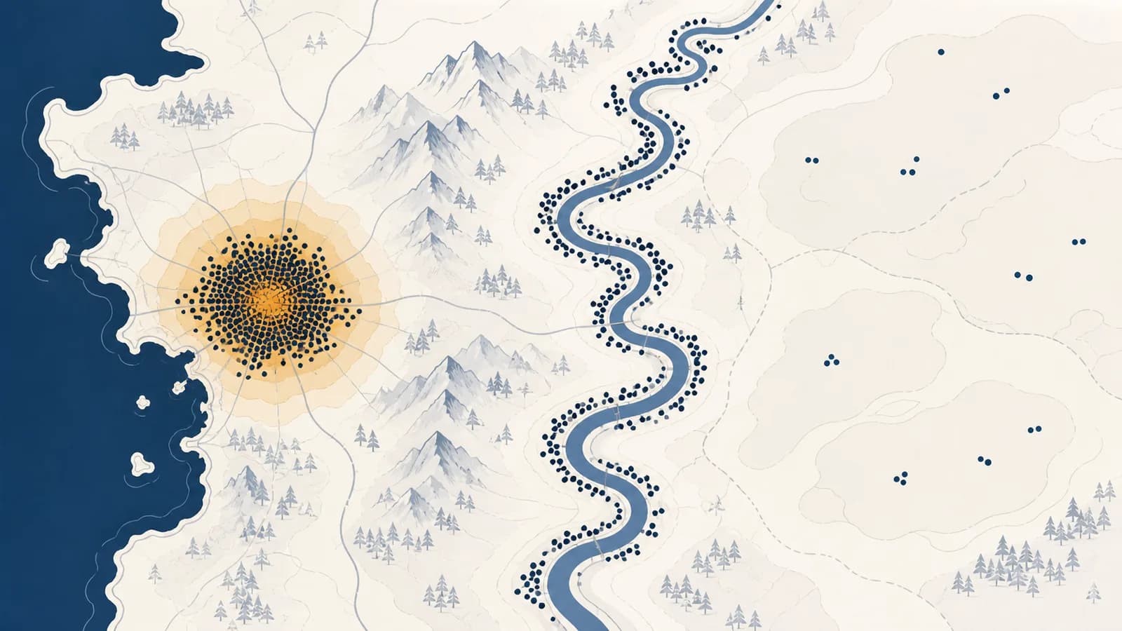
Population distribution and density is a geographic concept that describes where people live and how closely they are spaced, in the context of human settlement on Earth. Population distribution shows the pattern of inhabited and sparsely inhabited places, while population density measures people relative to land or another resource. Together, these ideas answer common searches such as “where do people live?” and “how is population density calculated?” The idea exists because a population total alone cannot show pressure on housing, farmland, transport, water, schools, or health services.
Imagine two regions, each with 500,000 residents. One is a compact city surrounded by a fixed boundary. The other includes several towns, farms, forests, and mountains. Their totals match, but the daily geography of their residents does not. A planner needs to know not only how many people exist, but where they are, how concentrated they are, and what parts of the region they can actually use.
What population distribution actually is
Population distribution is the spatial pattern made by people’s places of residence across an area. It describes where settlements are located, how large they are, how far apart they lie, and which parts of the area have few or no permanent residents.
Distribution is a pattern, not a single number. On a map, people may appear clustered in a few cities, dispersed among farms and villages, or arranged in a linear pattern along a coast, river, road, or valley. Most real regions combine these forms. A country can have a heavily populated coastal belt, a chain of inland towns, and a large, lightly settled interior at the same time.
Geographers study several elements of a distribution:
- Location: the exact places where people live.
- Concentration: the degree to which residents gather in a small share of the area.
- Spacing: the distance between homes or settlements.
- Settlement size: the balance among isolated homes, villages, towns, and cities.
- Continuity: whether settlement forms an unbroken occupied zone or separate pockets divided by lightly inhabited land.
A dot map can make this visible. If one dot represents 1,000 residents, a tight field of dots suggests concentration, while isolated dots suggest dispersion. The dot usually does not locate every person precisely. It summarizes residents within a source area, so the map’s legend and method matter. A choropleth map works differently: it shades administrative units by a rate such as people per square kilometre. That display shows density by zone, not the exact locations of households.
Distribution asks “where?” A population can be unevenly distributed even if its average density is modest, because most residents may occupy only a small part of the mapped area.
Distribution also depends on the population being counted. A map of permanent residents differs from a map of workers at midday, tourists in a holiday season, or students during term. Census counts usually attach people to a usual residence. Emergency managers and transport operators often need the moving population as well.
How population density works
Population density works by dividing a population count by the area or resource base connected to it. The result is an average intensity, such as people per square kilometre, that allows places of different sizes to be compared on the same basis.
Worked example: 240,000 people divided by 600 square kilometres equals 400 people per square kilometre.
The unit must be stated. “A density of 400” is incomplete because it could mean 400 people per square kilometre, per square mile, or per hectare. Area units are squared: a square kilometre is a square measuring one kilometre on each side. Converting linear units without squaring the conversion produces a wrong answer.
Decide who counts, such as usual residents inside a district on census day. Mixing residents, visitors, and workers creates a numerator with no clear meaning.
Use the matching boundary and identify whether the measure covers land only or land and inland water. The numerator and denominator must refer to the same place.
Divide people by area, then report people per square kilometre or another stated unit. Keep enough precision for the decision, but do not imply accuracy the source data lacks.
Check the internal pattern. An average describes the whole unit, while residents may occupy only its towns, coast, or accessible valleys.
Suppose a district has 90,000 people across 300 square kilometres. Its density is people per square kilometre. If 72,000 residents live in a built-up zone covering 40 square kilometres, that zone has people per square kilometre. The district average is correct, but it hides the much greater concentration where most residents live.
Density is therefore a comparison tool, not a full portrait. It becomes more informative when paired with a map, a settlement classification, or a second denominator that represents the resource people depend on.
Arithmetic density versus physiological and agricultural density
Arithmetic density compares all people with all land, physiological density compares people with arable land, and agricultural density compares farmers with arable land. Each denominator answers a different question, so the three measures should not be treated as interchangeable rankings.
| Measure | Calculation | Question it helps answer | Main limitation |
|---|---|---|---|
| Arithmetic density | Total population ÷ total land area | How crowded is the territory on average? | Includes land that may be uninhabitable or unusable. |
| Physiological density | Total population ÷ arable land area | How many people depend on each unit of land suitable for crops? | Arable-land definitions and food imports affect the interpretation. |
| Agricultural density | Agricultural population ÷ arable land area | How many farmers work each unit of crop-growing land? | Occupational categories and farming technology differ between places. |
Consider a fictional country with 2,000,000 people, 100,000 square kilometres of land, 10,000 square kilometres of arable land, and 100,000 farmers. Its arithmetic density is 20 people per square kilometre. Its physiological density is 200 people per square kilometre of arable land. Its agricultural density is 10 farmers per square kilometre of arable land. Each result is produced from the same country, but each describes a different relationship.
Twenty people per square kilometre sounds lightly populated because the denominator includes the entire territory.
Two hundred people per square kilometre of arable land reveals a much tighter relationship between population and crop-growing land.
A high physiological density does not prove that hunger exists. A country can import food, grow high-yield crops, irrigate dry land, reduce waste, or earn export income that pays for food. It signals possible pressure on domestic arable land and prompts further questions. Agricultural density also needs context. Fewer farmers per unit of land may reflect machinery and high labour productivity, but it could also reflect abandoned farmland or missing workers.
Population distribution versus population density
Population distribution describes the arrangement of people across space, while population density compresses population and area into an average rate. Places can share the same density yet have different distributions, or share a similar distribution while having very different density values.
Take two square regions, each 100 square kilometres with 10,000 residents. Both have a density of 100 people per square kilometre. In Region A, the residents are spread fairly evenly among small settlements. In Region B, all residents occupy one compact town and the remaining land has no permanent homes. The arithmetic density is identical. The demand for buses, water pipes, clinics, and road maintenance is not.
Homes and villages cover much of the region. Services must reach many locations, and trips may be long even though no single place is intensely crowded.
Most infrastructure can focus on one town. The town may face congestion and limited space, while the regional average still appears moderate.
The reverse can happen too. Two countries may both have coastal concentration, yet one has far more people in each occupied square kilometre. Distribution words such as clustered or linear describe shape. Density values describe average intensity.
This distinction connects population analysis with the geography of settlement patterns, where the form and spacing of villages, towns, and cities become the main evidence. A density table without a settlement map can miss the structure that determines how people actually reach one another.
How maps reveal population patterns
Population maps reveal patterns by assigning counts or rates to locations, but every map transforms the source data through boundaries, symbols, and scale. Reading one well means checking what is counted, what area is used, and what spatial detail has been removed.
Dot maps show concentration without exact addresses
A population dot map places symbols within reporting areas, with each dot representing a stated number of people. Dense clusters of dots make major settlement zones visible. Unless the map says otherwise, the dot positions are usually approximate. A dot placed inside a census unit should not be mistaken for a particular house.
Choropleth maps compare rates inside boundaries
A choropleth map shades districts by density class. It is effective for comparing administrative areas, but it fills each district with one colour even when residents are clustered in a corner. Large, lightly populated units can dominate the page visually, while small dense cities almost disappear. The class breaks also matter: changing the cut-off values can make the same data look more or less divided.
Grid maps make units more comparable
A regular grid divides land into equal cells and estimates population in each one. This reduces the visual power of administrative boundaries and helps reveal corridors and clusters. The result is still an estimate, especially where census data must be redistributed among cells using buildings, land cover, or other evidence.
That pipeline contains choices at every stage. A census can miss people or assign them to a usual residence that differs from their daytime location. A boundary can split one urban area into several authorities. A cartographer can use raw counts where rates would be fairer, or use rates where actual totals matter more. The finished map is evidence, but it is also a model.
A useful reading routine is to inspect the title, date, legend, unit, source population, boundary type, and scale before interpreting the colours. Then compare the map with physical features and transport routes. A line of high population cells may follow a river valley, but the map alone does not prove the river caused the settlement. Historical land ownership, industry, a railway, or government policy may be involved.
How physical and human factors shape distribution
Population distribution forms through the combined effects of environmental opportunities, hazards, access, jobs, institutions, and past decisions. These factors change the costs and benefits of living in a place, then migration and natural population change alter the pattern over time.
Physical geography affects settlement through mechanisms that can be traced. Reliable freshwater supports drinking, sanitation, farming, and industry. Flat or gently sloping land reduces some building and transport costs. Deep, well-drained soils support many forms of agriculture. Harbours can connect inland production with sea trade. Extreme cold, persistent water shortage, steep slopes, poor soils, or frequent hazards can raise costs. None of these conditions acts as an absolute command. Engineering, wealth, trade, and political choices can offset constraints, while conflict or exclusion can keep people away from environmentally favourable land.
Human factors often explain the precise pattern better than climate alone. Jobs draw workers within commuting distance. Roads and railways reduce travel time and encourage development around stations and junctions. Schools and hospitals attract households and employees. Borders can channel trade through checkpoints. Planning rules permit dense apartments in one zone and detached houses in another. Land prices push some households toward smaller dwellings or longer commutes. Earlier investment then reinforces the pattern because firms and families value access to existing customers, suppliers, skills, and infrastructure.
A new rail station cuts the trip between an outer town and a major employment centre. Developers build homes near the station, shops follow the growing customer base, and bus routes are adjusted to feed the rail line. Population becomes more concentrated around the transport node. The change is not caused by the station alone: land permission, fares, housing demand, and available jobs determine how strong the response becomes.
The relationship with how transport networks connect places is two-way. Routes influence where development is practical, but a large settlement also creates demand that can justify new routes. Cause and effect can reinforce one another.
History remains present in modern distributions. A port may keep its population after the original trade has declined because streets, housing, political offices, and cultural ties already exist there. A former mining town may shrink after its main employer closes, yet residents, buildings, and transport links do not vanish immediately. Population geography therefore includes path dependence: past choices shape the options available now.
How population density shows up in public services
Public services use population density and distribution to decide where facilities belong, how large they should be, and how people will reach them. The same population total can require very different networks when residents are concentrated, dispersed, seasonal, or rapidly moving.
A school planner needs the number and ages of children, but also their addresses and expected travel times. One large school may work in a compact district. In a dispersed rural area, the same enrolment could require smaller schools, long bus routes, boarding provision, or remote teaching. Closing a lightly used facility may save building costs while increasing transport time and reducing access.
Health services face a similar trade-off. A specialist hospital benefits from concentrating staff and equipment where enough patients can reach it. Basic clinics may need wider distribution so routine care is close to homes. Ambulance planning depends on road travel time, not straight-line distance or average density. A mountain, river crossing, or congested junction can separate a nominally nearby population from a facility.
Those shares come directly from the hypothetical district calculation, not from a survey. They show why allocating every service according to total land area would be wasteful. Most capacity should be near the population cluster, but the remaining residents still need acceptable access.
Water, sewage, electricity, rubbish collection, and broadband all have network costs. Closely spaced customers can share shorter lengths of pipe or cable. Very high density can also overload old systems, leave little room for upgrades, and magnify the effect of a failure. Density creates possible efficiencies, not guaranteed ones. The age, design, maintenance, and governance of infrastructure decide the outcome.
Electoral districts and administrative budgets also rely on population geography. Equal land area would not produce equal representation where settlement is uneven. Boundary makers compare resident counts and communities, while governments use small-area population estimates to direct funds. These decisions connect population patterns with territory and political power.
How businesses, emergency teams, and environmental planners use density
Businesses, emergency teams, and environmental planners use population data to estimate demand, exposure, access, and resource pressure. They rarely rely on one density figure because customers move, hazards cross boundaries, ecosystems vary, and averages hide the locations that drive decisions.
Businesses estimate a reachable market
A shop may begin with residential density, then add income, age, competing stores, daytime workers, road access, and travel time. A dense neighbourhood does not guarantee sales if a river blocks access or if the product does not match local demand. Delivery firms care about stop density because closely grouped addresses can reduce distance per parcel. Mobile services may prefer dispersed areas where customers cannot easily reach a fixed site.
Emergency teams map exposure and access
A hazard map shows where flooding, wildfire, ground shaking, or another event may occur. A population map shows who may be exposed. Combining them identifies inhabited risk zones, but responders also need time of day, building type, mobility, road capacity, and people who require assistance. An uninhabited floodplain can have high physical hazard and low population exposure. A dense neighbourhood outside it can have high population but low exposure to that specific flood.
Hazard is not the same as disaster risk. Risk depends on the hazard, the people and assets exposed to it, their vulnerability, and their capacity to prepare, respond, and recover.
Evacuation plans reveal why distribution matters. Ten thousand people in one compact settlement may create congestion at a few exits. The same number spread among remote valleys may be harder to warn and reach. One pattern concentrates traffic; the other stretches communication and rescue resources.
Environmental planning separates people from consumption
Population density can indicate where local demand for water, land, and waste services is concentrated. It cannot measure environmental impact by itself. A smaller, wealthier population with high consumption may use more resources than a larger population with low consumption. Imports also move the land and water demands of consumption beyond the place where buyers live.
Dense settlement can limit the land occupied per resident and support frequent public transport. It can also create heat, pollution, habitat fragmentation, and stormwater problems if design and infrastructure are poor. Dispersed settlement may offer private space while requiring longer roads, pipes, and trips. Claims that density is automatically good or bad erase the mechanism that planners need to examine.
Four mistakes people make with density
Four common mistakes are treating an average as an even spread, comparing mismatched units or boundaries, assuming density directly causes social outcomes, and confusing people with buildings. Each error turns a valid calculation into a misleading claim about lived conditions.
1. Treating an average as an even spread
A regional density of 50 people per square kilometre does not mean every square kilometre contains 50 people. There may be a dense city and a large empty upland. Fix this by pairing the average with a finer map, the share living in built-up areas, or densities for smaller zones.
2. Comparing mismatched units or boundaries
A city measured inside a tight municipal boundary can appear denser than a city whose boundary includes rural land. One source may use land area while another includes inland water. One may report square miles and another square kilometres. Before ranking places, match the date, population definition, area definition, and unit.
3. Assuming density directly causes an outcome
Dense places sometimes have expensive housing, congestion, or rapid disease transmission, but density alone does not establish the cause. Housing prices also reflect supply rules, incomes, credit, land ownership, and demand. Congestion depends on travel behaviour and network capacity. Disease transmission depends on contact, ventilation, immunity, and public health measures. Density changes conditions under which processes occur; it does not replace those processes.
4. Confusing population density with building density
A skyline of tall offices may hold few residents at night. A district of low-rise apartment blocks can house many people. Building density measures floor area, dwellings, plot coverage, or building volume. Population density measures people. The measures are related only after occupancy, household size, vacancy, and land use are known.
This is a constructed summary, not an attributed quotation. It works as a checking rule: if any of those five pieces is missing, pause before drawing a conclusion.
How migration and urbanization change the pattern
Migration changes distribution by moving people between places, while births and deaths change populations where people already live. Urbanization increases the share of a population living in urban settlements, so it can concentrate growth even when the national population changes slowly.
A settlement grows through two direct demographic routes: natural increase, when births exceed deaths, and net in-migration, when arrivals exceed departures. Housing construction may allow that growth to spread outward, while redevelopment can add residents within the existing built-up area. If people leave a rural district for a city, the destination may gain density as the origin loses residents or ages.
Urbanization is a change in the urban share, not simply the construction of tall buildings. A country can urbanize as villages become towns, as existing cities grow, or as official classifications change. The consequences depend on where housing and jobs appear. the processes that make populations more urban explains those mechanisms in their own right.
How scale and boundaries change the answer
Scale and boundaries change density because they determine which people and which land enter the calculation. A national average, a metropolitan average, and a neighbourhood average can all be correct while describing different spatial relationships and supporting different decisions.
This effect is easiest to see with a boundary change. Suppose a town has 50,000 people in 25 square kilometres, giving 2,000 people per square kilometre. Its authority then merges with 75 square kilometres of surrounding land holding 10,000 people. The new unit contains 60,000 people in 100 square kilometres, so its density is 600 people per square kilometre. No household moved. The measured density fell because the reporting area changed.
Aggregation can also reverse apparent relationships. A district-level map might suggest that the densest districts have the best access to parks. A neighbourhood map could reveal that parks lie mainly in affluent, lightly populated parts of those same districts. Geographers call problems created by changing spatial units the modifiable areal unit problem. The practical response is to test more than one scale and inspect the raw geography.
Population patterns make human geography visible
Population distribution and density make human geography visible by connecting people to land, resources, settlements, movement, and political boundaries. Used together, they turn a population total into a spatial explanation that can guide questions about access, pressure, inequality, and change.
The useful habit is simple. When a number describes people in a place, ask five things: Who was counted? What boundary was used? What is the denominator? How are people arranged inside it? What process could have produced or changed that pattern? Those questions separate calculation from interpretation without treating either as optional.
You can practise with a familiar place. Find its population and land area from the same source and date, calculate arithmetic density, then sketch where homes and settlements actually lie. Add a road, river, steep slope, job centre, or public facility. The gaps between the average and the map will show what the density figure hides and what the distribution reveals.
The takeaway: Density measures average intensity, distribution shows spatial arrangement, and both need a clear population, boundary, unit, scale, and date before they can support a sound geographic claim.
This way of thinking extends across the wider set of geography explanations: places make sense when physical conditions, human decisions, spatial patterns, and scale are examined together. Notice the next density claim you meet in news, planning, property, or public health, and test what its average includes.