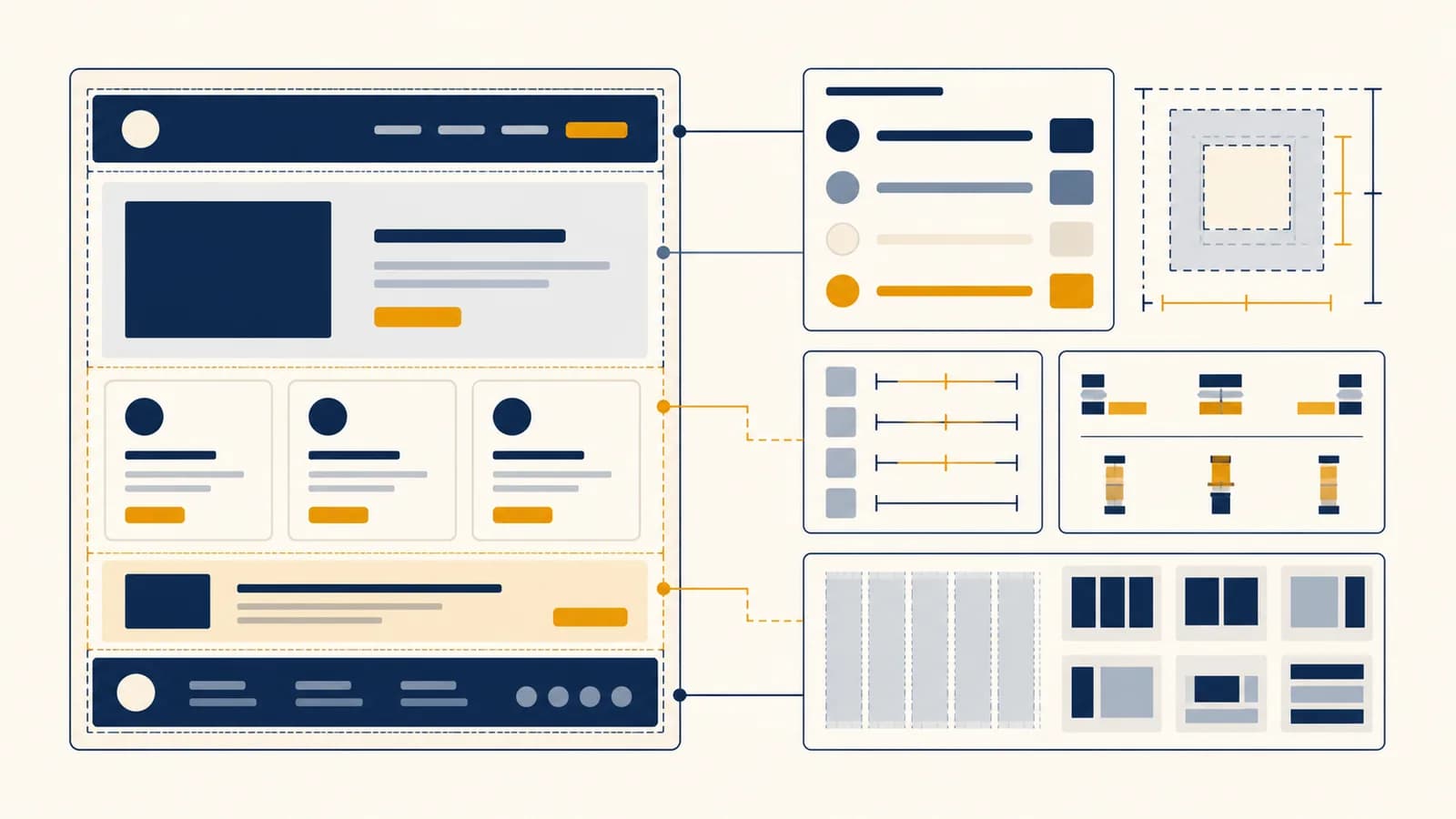
HTML and CSS are web languages that describe a page's structure and appearance, in the context of websites and browser-based applications. If you search for what HTML and CSS are, how HTML works, how CSS works, or how to build a web page, the short answer is this: HTML identifies the content, while CSS gives the browser rules for presenting it. They exist so one document can be understood by machines and shown in useful forms on phones, laptops, screen readers, printers, and devices that have not been designed yet.
What HTML actually is
HTML, or HyperText Markup Language, is a markup language that gives content a meaningful structure. It labels a piece of content as a heading, paragraph, link, image, list, form control, or another defined kind of element.
An HTML file is plain text containing elements. Most elements have an opening tag, content, and a closing tag. In <p>A browser reads this paragraph.</p>, the tags tell the browser what the text is. The tags do not say that it must be blue, centered, or printed in a particular font. Those are presentation decisions.
Some elements carry extra information in attributes. A link can have an href attribute containing its destination. An image can have a src attribute naming the image file and an alt attribute giving a text alternative. The attribute belongs inside the opening tag:
A complete link element: <a href="/weather">Local weather</a>. The element type is a, the destination is /weather, and the visible link text is Local weather.
Elements can contain other elements, which creates a hierarchy. A news article might contain a heading, several paragraphs, and a figure. The figure might contain an image and a caption. This nesting is not cosmetic. It records which caption belongs to which image and which content belongs to the article.
HTML is called hypertext because links connect one document to another. It is called markup because tags annotate content without replacing the content itself. It is a language because its element names, nesting rules, and meanings form a system that browsers and other software can interpret consistently.
How HTML becomes a page in the browser
The browser reads HTML as a stream of text, recognizes tags and attributes, and builds an in-memory tree called the Document Object Model. It then uses that DOM tree as the structured content needed for styling, scripts, accessibility tools, and display.
Suppose the browser receives <main><h2>Bus times</h2><p>Next bus: 08:40</p></main>. It does not store that as a picture. It creates a main node with two child nodes, an h2 and a p. Each of those holds a text node. Developer tools can show this tree and let you inspect it.
The browser requests a URL. A server replies with bytes and identifies the response as HTML.
The HTML parser recognizes start tags, end tags, attributes, and text. Defined error-handling rules let it recover from many malformed documents.
The parser turns the sequence into parent and child nodes. A closing tag usually ends the current element and returns parsing to its parent.
The browser matches CSS rules to DOM elements, calculates sizes and positions, then paints pixels. Scripts may later change the DOM and trigger updated work.
This explains a common surprise: the DOM can differ from the exact source text. If markup is invalid, the parser may insert or rearrange elements according to HTML's recovery rules. The Elements panel shows the DOM after parsing, while View Source usually shows the response the server sent.
HTML also gives software meaning beyond layout. A browser knows that a button can receive keyboard focus and be activated. A search engine can recognize a heading. A screen reader can announce a list and its number of items. A generic div carries no such built-in meaning.
What CSS actually is
CSS, or Cascading Style Sheets, is a rule language that controls how structured documents are presented. A CSS rule selects elements and assigns property values such as color, spacing, width, alignment, font size, or grid position to them.
A basic rule has a selector and a block of declarations. In p { color: navy; line-height: 1.6; }, p selects paragraph elements. Each declaration pairs a property with a value. The browser applies both declarations to matching paragraphs unless another part of the cascade produces a winning value.
Selectors can target an element type, a class, an identifier, an attribute, a state, or a relationship. .warning matches elements whose class attribute includes warning. nav a matches links inside a nav. button:hover matches a button while a pointing device is over it.
| Selector | What it matches | Typical use |
|---|---|---|
article | Every article element | Shared article layout |
.price | Every element with the price class | Reusable visual role |
#checkout | The element whose ID is checkout | A unique page target |
input:focus | An input that currently has focus | Keyboard focus feedback |
main > h2 | An h2 directly inside main | Parent and child relation |
CSS values can be fixed or relative. 16px names a length in CSS pixels. 1.5rem is one and a half times the root element's font size. 50% depends on another value defined by the property. Relative units help a layout respond to user settings and available space.
A stylesheet can be linked from many HTML documents. That separation lets a site change its type, color, and layout rules without rewriting every paragraph and link. It also lets the same HTML be presented differently on a screen and on paper.
How the cascade chooses the winning style
The CSS cascade resolves competing declarations by comparing their origin and importance, cascade layer, selector specificity, scoping proximity where applicable, and source order. Inheritance then supplies some values to descendants that have no winning declaration of their own.
The word cascading refers to this conflict-resolution system. Consider a button with class="buy" and these rules: button { color: black; } followed by .buy { color: green; }. Both match. The class selector has greater specificity than the type selector, so green wins. Reversing their order would not change that result.
If two competing declarations have the same origin, layer, importance, and specificity, the one later in source order wins. For example, .buy { color: green; } followed by .buy { color: purple; } produces purple text. Source order matters only after the earlier comparisons tie.
#sale .buy button has the specificity tuple (1,1,1), while .shop .buy has (0,2,0). Compare the first differing column, so (1,1,1) wins.
This tuple is a teaching model for selector specificity, not a decimal number. One ID selector does not become equivalent to some pile of class selectors. Inline styles and declarations marked !important also require the wider cascade rules, so the tuple alone cannot explain every conflict.
Inheritance is a separate mechanism. Text color normally passes from a parent to its children, which makes body { color: #222; } useful. Margins do not inherit, because passing a container's outside spacing to every descendant would be disruptive. The browser's developer tools can show which declarations were overridden and where an inherited value began.
How the box model and layout turn rules into geometry
Every displayed element generates one or more boxes, and CSS layout calculates each box's content area, padding, border, margin, and position. Layout systems such as normal flow, flexbox, and grid decide how those boxes share the available space.
Under the default content-box sizing model, a declared width applies to the content only. If a box has width: 300px, left and right padding of 20px, and left and right borders of 2px, its visible border-box width is . Horizontal margins occupy still more space outside that border.
With box-sizing: border-box, the declared width includes content, padding, and border. The same 300 pixel declaration then produces a 300 pixel border box, leaving for content. Many projects apply this sizing model broadly because it makes component dimensions easier to predict.
Normal flow is the default. Block boxes generally stack vertically, while inline content runs within lines and wraps. Flexbox arranges items primarily along one axis, which suits a navigation row or a set of controls. Grid controls rows and columns together, which suits a page region or a card collection.
A shop's product row contains an image, description, price, and button. Flexbox can let the description grow while the price and button keep their needed width. On a narrow screen, a media query can switch the row to a vertical arrangement. The HTML content remains the same.
Positioning changes how a box participates. A relatively positioned element keeps its original place while being visually offset. An absolutely positioned element is taken out of normal flow and positioned against a containing block. Fixed positioning attaches a box to the viewport. These tools are useful, but using absolute positioning for an entire page often causes overlaps when text grows.
HTML versus CSS
HTML describes what content is and how it is organized, while CSS describes how that content should be presented. They cooperate during rendering, but replacing semantic HTML with visual CSS, or placing presentation choices into structure, makes a page harder to use and maintain.
<button>Save draft</button> identifies an operable button, gives it text, and supplies built-in keyboard and accessibility behavior.
button { padding: .6rem 1rem; } changes the button's spacing. Removing the CSS changes its look but does not erase its identity as a button.
A div styled to look like a button is still a generic container. It does not automatically respond to the Enter or Space key, join the tab order, or expose button semantics to assistive software. Extra code can imitate those behaviors, but the native button already has them.
CSS is also not a programming language in the usual imperative sense. It has variables called custom properties, conditional features such as media queries, and calculations such as calc(). Still, its main job is declarative: state the desired presentation rules, then let the browser resolve them. For browser behavior, state changes, and network requests, the web's JavaScript language supplies programmable logic.
The division is not perfectly physical. An image URL may appear in HTML when the image is content, or in CSS when it is decorative. A product photo belongs in HTML because it carries information and needs alternative text. A faint texture that can disappear without losing meaning can be a CSS background.
How responsive and accessible pages adapt to people
Responsive design lets one document adjust to different spaces and input methods, while accessible design ensures its content and controls remain perceivable and operable. Both begin with meaningful HTML, flexible CSS, and testing under conditions different from the author's usual setup.
A responsive page does not need a separate HTML file for every phone and monitor. Flexible widths, wrapping, grid, and media queries let the browser choose an arrangement based on available conditions. A rule inside @media (min-width: 60rem) can add a second column only when the viewport has enough room. A container query can respond to a component's own available width.
Accessibility begins with the correct element. Headings establish a navigable outline. Labels connect instructions to form fields. Alternative text conveys the purpose of informative images. Keyboard access allows a person who cannot use a mouse to reach and operate controls. Visible focus styling shows where the next key action will go.
Color cannot carry the whole message. A red border may be invisible to someone who cannot distinguish that color, and it gives a screen reader no error text. Pair visual styling with a clear message such as “Enter a valid email address.”
CSS can preserve or damage accessibility. Relative font units respect text preferences better than a layout built around rigid assumptions. Sufficient contrast keeps text readable. The prefers-reduced-motion media feature lets a page reduce nonessential animation when the user requests it. Hiding content with display: none normally removes it from both visual layout and the accessibility tree, which may be right or wrong depending on the purpose.
Test by zooming, widening text, narrowing the viewport, and using only the keyboard. Inspect heading order and form names with browser tools. Automated checks catch some missing names and contrast problems, but they cannot decide whether alternative text explains the image's actual purpose.
How HTML and CSS show up in real work
HTML and CSS appear wherever information or controls are delivered through a web browser, including news sites, online shops, government forms, workplace dashboards, documentation, and web applications. The same skills also matter in email templates and generated reports, with platform-specific limits.
A front-end developer turns interface requirements into components, connects them to data, and tests their behavior. A designer who understands CSS can specify layouts that respond rather than drawing only one fixed screen. A content editor uses heading, link, and image semantics in a publishing system. A quality engineer inspects the DOM, tests keyboard operation, and checks layouts at different widths.
Consider an emergency alert page. HTML identifies the alert heading, affected locations, time, instructions, and source link. CSS makes urgent information easy to scan, but the markup keeps the reading order coherent if styles fail. A script may request updated alerts from a service, a topic covered by how APIs let software exchange data. Each layer has a different job.
In an online bank, HTML labels account values and form controls. CSS aligns tables, separates warnings, and adapts navigation to screen size. Security does not come from hiding a button or coloring a field. It requires server-side authorization, safe data handling, and other controls beyond HTML and CSS.
Many visual defects are really rule conflicts or geometry problems. A card overflows because its content cannot wrap. A menu sits behind a dialog because stacking contexts determine paint order. A style appears crossed out because a more competitive declaration won the cascade. The methodical process taught in finding and explaining software bugs applies directly: reproduce the fault, inspect the actual state, isolate a cause, and verify the correction.
HTML and CSS also create durable transferable knowledge. Frameworks may offer component syntax and utility classes, but their output still becomes DOM elements and CSS rules in a browser. Knowing the underlying platform makes framework behavior less mysterious and makes generated code easier to inspect.
Five mistakes people make with HTML and CSS
Most early problems come from treating markup as a picture, ignoring the cascade, forcing fixed geometry, choosing elements by appearance, or changing many rules without isolating the cause. Each mistake hides information that the browser already makes available for diagnosis.
1. Choosing an element because of its default appearance
An HTML element should match the content's meaning, not the browser's initial styling. A developer may choose an h3 because its default size looks right, even when the text is not a heading. CSS can resize any real heading; false structure misleads navigation tools and search software.
2. Using IDs and important declarations to overpower every conflict
Highly specific selectors and repeated !important declarations can win today while making tomorrow's overrides harder. A smaller set of reusable classes usually produces more predictable competition. Cascade layers can establish an order among resets, components, and utilities without escalating selector strength.
3. Fixing heights on boxes that contain text
Text can wrap onto more lines when a screen narrows, a translation uses longer words, or a user increases type size. A fixed height may then clip or overlap content. Prefer content-driven height, and use min-height only when a minimum shape serves a real layout need.
4. Copying CSS until the symptom disappears
Adding random declarations can mask the cause and create a second defect. Inspect the element's computed styles, box model, and matched rules first. Turn candidate declarations off one at a time. If the correction depends on source order, record why that order is intended.
5. Testing only one viewport and one input method
A page that looks correct on the author's laptop may fail with a narrow viewport, keyboard navigation, zoom, long content, or an empty result. Test representative states, including loading, error, and success. Good structure makes those tests easier because elements have recognizable roles.
That claim changes debugging from decoration by trial and error into evidence-based work. Start with the element that is wrong, identify its box and winning declarations, then move outward to the parent layout. If the displayed DOM is unexpected, move backward to the source and parser behavior.
How do forms connect labels, fields, and submitted data?
An HTML form groups controls that collect input and submit named values. Labels identify controls, input types provide suitable behavior, and each successful control contributes a name and value that the browser can encode for a server when submission occurs.
In <label for="email">Email</label><input id="email" name="email" type="email">, the label's for value matches the input's id. Activating the label focuses the field, and accessibility software can use that relationship to announce its name. The name is separate: it becomes the key attached to the submitted value.
Input types help browsers provide appropriate controls and basic validation. An email field can expose an email-friendly keyboard on a phone. A date input may provide a date picker. Browser validation improves feedback, but the server must still validate all received data because a client request can be modified or constructed without the form.
How do CSS animations move without changing the HTML?
CSS animations change computed property values over time, using transitions between states or keyframes that define multiple stages. The browser redraws the affected presentation while the underlying HTML structure can remain unchanged, unless a script also modifies the document.
A transition can animate a button's background color when its state changes. A keyframe animation can vary opacity and transform across a cycle. Movement is not free: large painted areas and layout-changing properties can require more browser work than opacity and transforms. Animation should communicate state or spatial relation, not delay the task.
Motion also needs an off switch. A prefers-reduced-motion: reduce query can shorten or remove nonessential effects for users who request less motion. Important state changes must still be understandable when the animation is absent.
How can browser tools reveal what the page is doing?
Browser developer tools expose the parsed DOM, matched CSS rules, computed values, box geometry, network requests, accessibility information, and performance activity. They let a developer compare assumptions with the browser's actual interpretation instead of editing blindly and refreshing at random.
Use the element picker to select a visible item. In the Styles panel, crossed-out declarations lost the cascade or are inactive. In Computed styles, the final value shows what the element receives after cascading and inheritance. The box-model diagram displays content, padding, border, and margin dimensions.
Temporary edits in developer tools are experiments, not saved source changes. If setting min-width: 0 stops a flex child from overflowing, the experiment identifies a likely fix. Apply it in the stylesheet, reload, and test again. Save meaningful checkpoints with version control so a correction can be compared, reviewed, or reversed.
The takeaway: Read the page as the browser does. Find the DOM node, trace the winning style, inspect its box, and test the behavior with real content and more than one way of interacting.
HTML and CSS make browser output explainable
HTML and CSS connect structured information to visible, usable interfaces through defined parsing, cascade, and layout systems. Learning those systems turns a web page from a mysterious picture into a program output whose causes can be traced, tested, and improved.
This topic belongs to the wider study of Computer Science because it links representation, algorithms, interfaces, and human use. The browser parses a formal language, builds data structures, resolves competing rules, computes geometry, and produces pixels. A person then tries to read, decide, or act through that result.
Build one small page with a heading, navigation, article, image, list, and form. Use semantic elements before adding classes. Then style it with normal flow, one flex layout, one grid layout, and a narrow-screen media query. Finally, inspect every element in developer tools, use the page by keyboard, zoom the text, and explain each visible result by naming the rule that caused it.