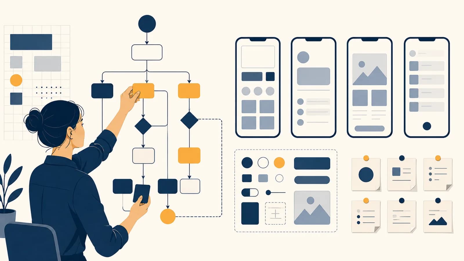
UI and UX design is a software design discipline that shapes what people see, what they can do, and how easily they can achieve a goal in a digital product. UI design, or user interface design, covers screens, controls, type, color, spacing, and visual states. UX design, or user experience design, covers the wider path through a website or app: research, structure, interaction, feedback, errors, and testing. The discipline exists because working code can still confuse people, hide important choices, or make a simple task needlessly difficult.
Consider a school portal that accepts an assignment but leaves the button unchanged. The database may contain the file, yet the student sees no confirmation and uploads it again. The failure is not in storage. It is in the conversation between the system and the person using it. UI and UX designers make that conversation visible, predictable, and forgiving.
What UI and UX design actually is
UI and UX design is the work of deciding how a digital system presents itself and how a person moves through it. UI concentrates on the interface at each moment, while UX connects those moments into a complete, useful experience.
A user interface is the boundary where a person and a system exchange information. A touchscreen button, a search field, a warning message, a keyboard shortcut, and a spoken command can all be interface elements. They expose some of the software's capabilities while hiding implementation details such as database queries and network requests.
A user experience is the person's whole encounter with a product in pursuit of a goal. It begins before the first click, because expectations come from advertisements, instructions, prior products, and the situation. It can continue after the screen closes, as with a delivery notification or a charge on a bank statement.
Should the primary button say "Save draft" or "Save"? What color, size, position, focus style, and disabled state should it have?
Should a draft save automatically? Can a person leave and return? How is recovery handled after the connection fails?
The two areas overlap. A button label is visual text, but it also changes whether a person predicts the correct outcome. An automatic save feature is a product behavior, but it needs a visible status such as "Saving" and "Saved." Job titles vary too. A product designer may handle both UI and UX, while a larger team may divide research, interaction design, visual design, content design, and accessibility among specialists.
How a user centered design process works
A user centered design process turns an uncertain problem into a tested interface through repeated cycles of research, definition, sketching, prototyping, testing, and revision. Each cycle replaces assumptions with observations before expensive engineering choices become difficult to change.
The process starts with a goal, not a screen. "Build a dashboard" already assumes a solution. "Help a bus dispatcher notice delays and respond" states a problem. The second framing allows several answers, including alerts, a map, a prioritized list, or a combination chosen after observing the work.
Interview people, observe the task, examine support requests, and learn the constraints. Record what people do as well as what they say.
Name the user, goal, obstacle, context, and evidence. A useful problem statement is narrow enough to test but open enough to permit more than one solution.
Sketch several flows and layouts quickly. Comparing alternatives exposes hidden assumptions that one polished idea can conceal.
Make the least detailed model that can answer the current question, such as paper screens for navigation or working code for keyboard behavior.
Give representative users realistic tasks, observe where expectations and system behavior disagree, fix the causes, and test again.
This sequence is not a one way production line. Testing may reveal that the team defined the wrong problem. Engineering may uncover a delay that changes the interaction. Research may show that two user groups need different flows. Iteration is controlled correction: the team updates the design as evidence improves.
Suppose a clinic wants patients to reschedule appointments online. Research shows that patients often need to compare the new time with work and transport plans. A design that releases the old slot as soon as "Reschedule" is pressed creates anxiety. A better flow lets the patient inspect alternatives, select one, review the change, and confirm before the original booking is released.
Teams connect this work to implementation. A designer specifies behavior and states; a developer turns them into components and data flows; both inspect the built product. The guides to how browsers, servers, and interfaces form a web product explain the technical layers that make many interface decisions possible.
How interfaces turn intentions into actions
An interface works by presenting perceivable controls, suggesting possible actions, accepting input, changing system state, and returning feedback. Good interaction design keeps the person's mental model close enough to the software's actual model that results remain predictable.
Every interaction begins with a goal, such as sending a photo. The person forms an intention, looks for a control, acts, observes the response, and judges whether the goal was reached. Trouble can occur at either side. A person may not know what action is possible, or may not understand what happened after acting.
Controls must reveal what can be done
A control's appearance, label, location, and surrounding context should make its action discoverable. A raised rectangle labeled "Upload photo" gives more information than an unexplained symbol. Familiar patterns help, but familiarity depends on audience and context. A gesture known to frequent smartphone users may remain invisible to someone using the product for the first time.
Designers call a perceived clue about use a signifier. Underlined text often signifies a link. A handle of dots may signify that an item can be dragged. The action itself is an affordance; the visible clue is what helps a person find it.
Feedback must expose the result
After input, the interface should show that it received the action and what state followed. Pressing "Pay" might immediately disable duplicate submission, show progress while the request travels, then show a receipt or an actionable error. Without those states, delay looks like failure.
You tap "Order" on a weak connection. Nothing visible changes, so you tap twice more. Three requests reach the server. A safer design acknowledges the first tap at once, prevents duplicate orders while processing, and gives one final result linked to an order number.
Feedback should match the scale and timing of the event. A tiny color change may be enough for selecting a filter. Deleting a project needs a clearer confirmation and a recovery path. Animation can explain that an item moved, but excessive motion delays work and can make some people ill. Reduced motion settings let the interface preserve meaning without unnecessary movement.
Constraints and mappings reduce mistakes
A constraint prevents an invalid action or makes it harder. A date picker can block dates before today when booking a future visit. A mapping connects control and effect: volume increases as a slider moves right in many left to right interfaces. Natural mappings reduce the amount a person must remember.
Constraints require care. Disabling a submit button without explaining the missing requirement traps the user. It is often better to keep the action available, then identify the exact field that needs attention. The system should accept reasonable input formats where possible, such as spaces in a card number, and normalize them internally.
UI design versus UX design versus frontend development
UI design specifies the visible and interactive layer, UX design shapes the complete path and its usefulness, and frontend development implements interface behavior in code. They solve connected problems, but their methods, deliverables, and tests are not identical.
| Area | Main question | Typical work | Common evidence |
|---|---|---|---|
| UI design | Is each state clear and coherent? | Layout, type, color, components, icons, responsive states | Visual inspection, accessibility checks, interface consistency |
| UX design | Can the right people complete a useful goal? | Research, task flows, information structure, prototypes, testing | Observed behavior, task outcomes, recurring problems |
| Frontend development | Does the interface behave correctly in the device and browser? | Components, state management, requests, validation, performance | Automated tests, runtime behavior, performance measurements |
One person can perform all three roles, especially on a small project. The distinction concerns the work, not a wall between people. A frontend developer often catches interaction problems. A designer who understands HTML and CSS can judge what changes across screen sizes. Shared prototypes and design systems give the team a common language.
A mockup is not the finished interface. It may show one ideal state at one screen width. Implementation must also handle long names, empty results, slow requests, server errors, keyboard focus, zoom, localization, permission denial, and old stored data. Learning how prototypes become dependable production software shows why these states belong in design work rather than appearing as late surprises.
Design includes every state. Loading, empty, error, success, disabled, focused, selected, and partially complete states are part of the product, even when a presentation mockup omits them.
Graphic design is another neighboring field. It contributes hierarchy, composition, typography, image treatment, and identity. UI design uses those skills inside an interactive system, where elements change state and people must act on them. A beautiful poster does not need to explain what happens after a tap; a software control does.
How information architecture and user flows organize a product
Information architecture groups, names, and connects content so people can predict where to find it, while user flows describe the sequence of decisions and system responses needed to complete a task. Together they turn a collection of features into a usable structure.
Information architecture answers questions about categories, labels, hierarchy, search, and navigation. An online shop might group items by activity, product type, or intended user. None is automatically correct. The best structure depends on what customers know and how they look for products. Research methods such as card sorting can reveal which items people expect to find together.
Labels must use the audience's language. An internal department name may be accurate to the company but meaningless to a customer. "Account operations" could hide what people actually seek: change a password, download an invoice, or close an account. Clear labels reduce interpretation before any screen styling begins.
A task flow exposes decisions and failure paths
A task flow maps the states required for one goal. For resetting a password, it might include entering an email, receiving a time limited link, choosing a new password, and returning to sign in. It should also include expired links, unknown addresses, delivery delays, and repeated requests.
The straight path is called a happy path, but most real products spend much of their logic outside it. A user goes back, changes a choice, opens two tabs, loses a connection, or lacks permission. Mapping alternate paths early makes the design more honest and gives developers testable cases.
Wireframes test structure before polish
A wireframe is a simplified representation of content, hierarchy, and controls. It may use boxes and plain text instead of final color and imagery. That low detail is useful because reviewers can discuss whether the right information appears in the right order without becoming distracted by shade choices.
Responsive structure also belongs here. A wide screen can show a navigation rail and work area together. A narrow phone screen may reveal them one at a time. The task must still be possible, and important actions should not disappear merely because the layout changes. The mechanics of designing and building software for mobile platforms add touch targets, operating system patterns, sensors, and interrupted use to this problem.
How prototypes and usability tests produce evidence
Prototypes are testable models of a proposed product, and usability tests reveal where that model conflicts with a user's expectations or abilities. The goal is to observe behavior on realistic tasks, diagnose causes, and revise before errors reach many people.
A prototype can be a paper sketch, a set of linked screens, a coded component, or a realistic simulation. Fidelity means how closely it resembles the final product in appearance, content, and behavior. Higher fidelity is not automatically better. The right prototype contains enough detail to answer a specific question.
A team should not code a complete account system to learn whether people understand the phrase "Create workspace." A few linked screens can answer that. Conversely, a static mockup cannot test whether keyboard focus moves correctly through a custom menu. That question needs functioning code.
A usability session tests the product, not the participant
The facilitator gives a task with a goal but avoids instructions that reveal the path. "Find out whether your order can arrive by Friday" is useful. "Click Shipping, then enter your postcode" teaches the interface instead of testing it. The participant talks through expectations when possible, while the team records actions, hesitation, errors, recovery, and comments.
Do not rescue too quickly. A pause may reveal a missing label or unclear hierarchy. If the facilitator immediately points to the control, the team loses evidence about what a customer would face alone.
After several sessions, the team looks for patterns and rates problems by harm, frequency in the observed sample, and difficulty of recovery. A participant's preference can inspire a change, but it is not a command. Designers compare comments with behavior and the product's purpose. One person asking for every option on the first screen does not prove that a crowded screen serves everyone.
Measurements need operational definitions
A useful measurement states exactly what counts. Task completion might mean reaching the correct confirmation without facilitator help. Time on task starts at the instruction and ends at the confirmed result. Error rate requires a defined set of errors. Vague claims such as "people liked it" are difficult to compare or act on.
If 7 of 8 observed participants complete a task under the stated rule, the observed rate is . This describes that test, not every future user.
Small tests are good at finding specific breakdowns, but their percentages can swing sharply with one person's result. Teams should report the sample, task, conditions, and completion rule beside the number. Product analytics can later show behavior at scale, though analytics reveal what happened more readily than why it happened.
How accessibility changes interface decisions
Accessible design makes a product perceivable and operable for people with varied vision, hearing, movement, speech, and cognition. It changes structure, input, content, and testing so that one narrow way of seeing or controlling a screen is not required.
Accessibility is not a special mode added after the regular product. Semantic headings help screen reader users move through a page, and they also create clearer document structure. Visible keyboard focus supports people who cannot use a mouse, plus anyone whose trackpad stops working. Captions support deaf viewers and people watching in a noisy room.
Meaning cannot depend on color alone
Red can reinforce an error, but text or an icon should also identify what went wrong. Someone with a color vision difference may not distinguish two hues, and a person using a screen reader may not receive color information at all. "Password needs at least 12 characters" is more useful than a red border by itself.
Keyboard order must follow task order
Interactive elements should be reachable with a keyboard, and focus should move in an order that matches the visual and logical sequence. A custom popup must send focus into itself, keep background controls from interfering, support an expected close action, then return focus to the control that opened it.
Structure gives assistive technology usable information
A button should usually be coded as a button, not as a generic box with a click handler. Native elements already expose roles, states, and keyboard behavior to browsers and assistive technology. Labels need programmatic connections to form fields. Alternative text should communicate an image's purpose in context, not list every visible detail.
A clickable rectangle looks like a button to a sighted mouse user, but it has no keyboard behavior, accessible name, or announced role.
A real button receives keyboard focus, activates through expected keys, and communicates its role. Styling can change its appearance without erasing its meaning.
Automated tools can find missing labels, invalid markup, and some contrast problems. They cannot decide whether link text makes sense, whether focus order matches the task, or whether an error is understandable. Manual keyboard checks and testing with disabled people provide evidence that rules alone cannot supply.
How UI and UX design shows up in real settings
UI and UX design appears wherever software mediates a consequential action, including hospitals, banks, factories, schools, government services, games, and transport. The setting changes the risks, vocabulary, interruptions, devices, and evidence that should guide the interface.
Healthcare interfaces manage attention under pressure
A medication screen must help a clinician distinguish patients, doses, units, timing, allergies, and order status. Similar drug names, crowded tables, or hidden updates can produce serious errors. Designers study the actual ward, including gloves, interruptions, shared computers, poor lighting, and the need to confirm responsibility.
More confirmation is not always safer. If every routine action triggers the same warning, people learn to dismiss warnings automatically. A useful alert identifies the specific risk, appears at the decision point, and offers a clear next action. The design team must work with clinicians, safety specialists, engineers, and applicable rules rather than infer medical work from a conference room.
Financial interfaces make consequences legible
A transfer screen should distinguish amount, currency, source, destination, fees, timing, and reversibility before confirmation. Masking sensitive details can protect privacy while still showing enough information to prevent a wrong account choice. A receipt creates a stable record after the action.
Trust comes from accurate behavior, not decorative badges. A banking app that labels a transfer "instant" while hiding a pending state breaks the person's model of where the money is. Status language should match the underlying system, such as scheduled, submitted, processing, completed, rejected, or reversed.
Public services must handle rare and stressful use
A person may apply for a benefit or permit only once, using unfamiliar legal language and documents gathered from several agencies. The interface should explain eligibility, required evidence, progress, deadlines, and what happens after submission. Saving partial work matters because the task may span days.
A parent starts an application on a phone during a bus ride, stops to find a document, and returns after the session expires. Good UX preserves completed work safely, explains what remains, and does not force the parent to guess which answers were lost.
These settings show why context beats generic taste. Large text may be needed because a screen is mounted at a distance. An offline state may matter because a worker is underground. A game may intentionally conceal information to create challenge, while a tax form should not. The goal and consequences define good design.
5 mistakes people make with UI and UX design
The most damaging UI and UX mistakes come from designing for an imagined user, polishing one ideal screen, copying patterns without context, hiding system state, and treating testing as approval. Each mistake removes evidence or conceals behavior that people need.
1. Starting with visual polish
Polished screens can make an unresolved idea feel finished. If the product asks for the wrong information or uses the wrong sequence, better shadows and colors do not repair it. Begin with the user goal, required content, task flow, and constraints. Add visual refinement when structure is stable enough to benefit from it.
2. Designing for yourself
The maker knows the product's terminology and remembers where controls were placed. A new user does not. Personal intuition is useful for generating a hypothesis, but observation must test it. Recruit people who resemble the intended audience in knowledge, ability, device, language, and situation.
3. Copying a fashionable pattern without its reason
A hidden menu may save space on a small screen but reduce discovery on a wide one. Infinite scrolling may support casual browsing but frustrate someone trying to return to a known result. Copy the reasoning only when the task, content, and constraints match. Surface appearance alone does not carry the original evidence.
4. Designing only the happy path
Real input is incomplete, duplicated, late, unauthorized, or temporarily unavailable. Define empty, loading, validation, permission, connection, and server failure states. Then provide recovery. Error messages should say what happened in language the person can understand, preserve valid work, and name the next possible action.
5. Asking users to approve the design
People are good sources about their goals, work, obstacles, and reactions. They cannot predict every future behavior by looking at a mockup. "Do you like it?" invites politeness and taste. A realistic task reveals findability, comprehension, control, and recovery through action.
Replace opinion with a task. Instead of asking whether checkout looks easy, ask a participant to buy two items, send them to a different address, and explain the final total before paying.
Design files can fail in another way: they can drift away from built software. Regular review of the actual product catches layout changes, missing focus states, unexpected text wrapping, and slow data. If behavior breaks, designers and developers can trace the visible symptom through interface state, input, network requests, and stored data until they find its cause.
What does a UI and UX designer actually deliver?
A UI and UX designer delivers evidence, decisions, and specifications that help a team build the right behavior. Outputs may include research findings, flows, wireframes, prototypes, interface components, content, accessibility notes, and documented rules for states and responsive layouts.
The useful deliverable depends on the next decision. Interview notes are raw evidence; a research summary turns repeated observations into supported findings. A flow diagram lets a team challenge missing paths. A prototype makes an interaction testable. A component specification records variants, states, spacing, content rules, and behavior so implementation remains consistent.
A design system is a maintained collection of reusable components, visual tokens, guidance, and code. Tokens name shared choices such as spacing or color roles. Components encode patterns such as buttons and dialogs. A system reduces repeated decisions, but it requires governance: someone must test changes, document use, handle exceptions, and keep design assets aligned with code.
Good handoff is a conversation supported by artifacts. A static measurement alone cannot explain how an element behaves while loading or what happens when text grows. Designers, developers, writers, researchers, and subject experts inspect the same flows and edge cases. The final source of truth is the working product experienced with real content and input.
How do UI and UX designers judge if a design is good?
Design quality is judged against defined user goals and product constraints using task success, errors, time, comprehension, accessibility, satisfaction, and operational outcomes. No single metric proves quality, so teams combine observed behavior, reported experience, and technical evidence.
Effectiveness asks whether people complete the correct task. Efficiency asks what effort, time, or number of steps it requires once learned. Satisfaction records perception, but a pleasant rating cannot excuse failed transactions. Accessibility checks who is excluded. Product outcomes ask whether the interaction supports a legitimate organizational goal without manipulating users.
Metrics can conflict. A one tap purchase is fast, but insufficient review may increase accidental orders. Additional verification slows sign in, but may protect valuable accounts. Designers make the tradeoff explicit, estimate the risk of each failure, test alternatives, and monitor what happens after release.
"The new page is cleaner and users seem to like it." The audience, task, observation, and outcome are undefined.
"First time applicants can locate the required documents, begin the form, save progress, and return without assistance in the defined test conditions."
Ethics belongs in the judgment. An interface can increase clicks by obscuring a cancel action, adding an item through a preselected box, or creating false urgency. These dark patterns serve a short term metric by interfering with informed choice. A good design makes material costs, commitments, and exits understandable before action.
UI and UX design makes computer science answerable to people
UI and UX design connects computer science to human goals by turning internal data and logic into understandable choices, feedback, and recovery. It makes software quality visible at the exact boundary where a person decides what the system can be trusted to do.
Algorithms operate on representations. Databases preserve state. Networks move requests. Security rules grant or deny access. The interface exposes selected parts of all four. A loading indicator reflects network timing. A permissions message translates an authorization rule. An undo action may require stored history. Good design therefore depends on understanding the system beneath the pixels.
The reverse is also true. Human needs change technical architecture. Offline editing requires local storage and conflict handling. Immediate search suggestions require fast retrieval and careful input handling. A clear audit history requires events to be recorded. UI and UX work does not decorate computer science after implementation; it supplies requirements that shape the implementation.
The takeaway: Pick one digital task you use this week. Write its goal, map every visible state, attempt it with only a keyboard, and note every moment when the system hides what happened. That small audit uses the same logic as professional UI and UX work.
You can connect those observations to the broader ideas and applications across computer science. Once you start watching interfaces as stateful conversations rather than static pictures, ordinary software becomes evidence: every label predicts an action, every delay needs feedback, and every error tests whether the system helps a person recover.