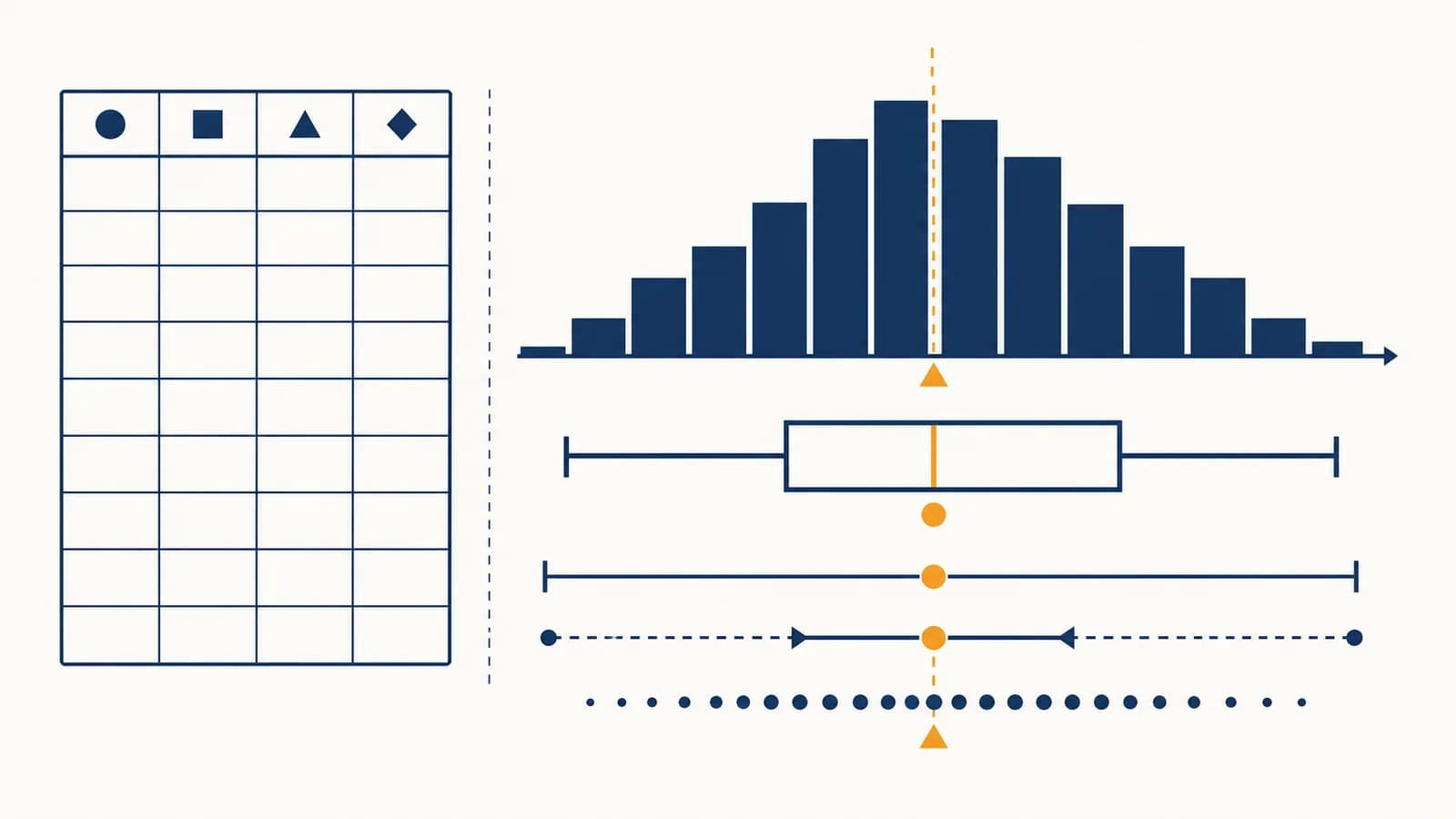
Basic statistics is a branch of mathematics that collects, summarizes, and interprets data, in the context of questions about groups, measurements, and uncertainty. It explains how to calculate the mean, median, mode, range, variance, standard deviation, percentages, and percentiles, then shows what those results do and do not say. The subject exists because a list of raw values is often too large or uneven to understand at a glance. Statistics turns that list into a smaller set of checkable descriptions while keeping enough detail to compare groups, spot patterns, and make decisions without pretending that every person or event is identical.
What basic statistics actually is
Basic statistics is the set of methods used to describe data and draw limited conclusions from it. It organizes observations, measures a typical value and variation, displays patterns, and separates what the collected data shows from what someone merely hopes it shows.
A data set is a collection of recorded observations. Each row often represents a person, object, place, or event. Each column represents a variable, something that can take different values. In a table of train trips, one row could be one trip, while the columns record route, scheduled time, actual time, and delay.
Statistics begins with a question because the question determines what should be measured. “Are trains late?” is too vague. “What was the median arrival delay for trains on this route during weekday mornings last month?” identifies a variable, a group, a time period, and a summary. The answer can then be checked against the records.
That pipeline contains two related kinds of work. Descriptive statistics summarizes the observations actually collected. Inferential statistics uses a sample to estimate or test something about a larger population. Basic work usually starts with description, since no inference can rescue badly defined or badly recorded data.
A statistic is not the raw data. It is a number calculated from data, such as a mean of 14 minutes or a range of 32 minutes. Different summaries preserve different features of the original list.
How data works from population to variable
Data works by assigning recorded values to clearly defined cases and variables. A study identifies the population of interest, observes all or part of it, applies consistent measurement rules, and keeps each value attached to the case that produced it.
The population is the full group a question concerns. A sample is the part actually observed. If a school wants to know how long all its students travel each morning, every enrolled student is the population. The 120 students who answer a questionnaire form the sample.
A sample can be large yet misleading. If the questionnaire is handed out only to students arriving by bus, walkers and cyclists have no chance to answer. This is selection bias: the method of choosing cases systematically favors some members of the population. Adding more bus riders would make the biased result more precise about bus riders, not more representative of the whole school.
Variables record categories or quantities
A categorical variable places a case into a group, such as bus, bicycle, walk, or car. A quantitative variable records a number with numerical meaning, such as 18 minutes or 4.2 kilometres. An identification number looks numerical but usually acts as a label, so averaging student ID numbers would be meaningless.
| Variable | Type | Sensible summaries |
|---|---|---|
| Travel method | Categorical | Count, proportion, mode |
| Travel time in minutes | Quantitative | Mean, median, range, standard deviation |
| Satisfaction: low, medium, high | Ordered categorical | Count, proportion, median category |
Measurement rules matter too. A travel time might begin when a student leaves home or when the vehicle moves. It might end at the school gate or the classroom. Either rule can be useful, but mixing them adds variation that comes from the measuring process rather than the trips. Units must also stay consistent. Converting hours and minutes into one unit is an application of reliable arithmetic with whole numbers and decimals.
A clinic compares patient waiting times. Staff define the start as check-in and the end as first contact with a clinician. That definition excludes treatment time and makes waits recorded by different staff members comparable.
How measures of center work
Measures of center replace a list with one value that represents its middle or typical level. The mean balances all values, the median locates the ordered middle, and the mode identifies the most frequent value or category.
Consider five delivery times in minutes: 12, 13, 14, 16, and 20. These values are already ordered. Their sum is 75, so the mean is 15. The third value is 14, so the median is 14. No value repeats, so this set has no mode.
For 12, 13, 14, 16, and 20: minutes.
The mean uses every value. Another way to understand it is as a balance point. Relative to 15, the deviations are , which sum to zero. Values below the mean balance values above it. This property makes the mean useful in later calculations, but it also makes the mean sensitive to extreme values.
The median depends on position
To find the median, order the values. With an odd number of values, take the single middle one. With an even number, average the two middle values. For 8, 10, 11, and 17, the middle pair is 10 and 11, so the median is . The result need not be one of the observations.
Now replace the 20 minute delivery with a 60 minute delivery. The ordered list becomes 12, 13, 14, 16, 60. The median remains 14, but the mean rises to 23. The median is therefore often better for a skewed distribution, including house prices or waiting times with a few very large values. Better does not mean universally correct. The choice depends on the question.
Uses every numerical value and acts as the balance point. One extreme observation can move it substantially.
Uses ordered position and resists extreme observations. It ignores the size of most gaps between values.
The mode answers a different question: which value occurs most often? The list 2, 2, 3, 4, 4 has two modes, 2 and 4. A mode can describe categories, so “bus” may be the modal travel method even though no arithmetic can be performed on the word. A data set may have one mode, several modes, or none.
How measures of spread work
Measures of spread describe how far observations lie from one another or from the center. The range uses the two extremes, the interquartile range uses the middle half, and variance and standard deviation use every numerical observation.
Two groups can share the same mean and still behave differently. Set A is 4, 5, 5, 6, 5. Set B is 1, 3, 5, 7, 9. Both have a mean of 5, but the values in B are much more dispersed. Reporting only the mean hides this difference.
The range is maximum minus minimum. It is quick, but it depends on only two observations. For Set B, . The interquartile range, or IQR, is . It spans the middle 50 percent after the values are ordered, so a single extreme value usually affects it less.
Variance turns deviations into a usable measure
Simply adding deviations from the mean does not measure spread because positive and negative deviations cancel. Variance squares each deviation before averaging. For the population 1, 3, 5, 7, 9, the mean is 5. The deviations are , and their squares are 16, 4, 0, 4, 16. Their total is 40, so the population variance is 8.
For 1, 3, 5, 7, and 9: , so .
Variance is measured in squared units, which can be awkward. If the values are minutes, the variance is in square minutes. Taking the square root gives the standard deviation, which returns to the original units. A small standard deviation means values cluster near the mean. A large one means they are more dispersed. It is a distance scale, not a guarantee that every observation lies within that distance.
How distributions reveal the shape behind a summary
A distribution shows which values a variable takes and how often they occur. Its shape reveals clusters, gaps, symmetry, skew, and unusual observations that a single mean or standard deviation cannot fully describe.
A frequency table counts observations in values or intervals. A bar chart suits categories because separate bars represent distinct groups. A histogram suits quantitative measurements because adjacent intervals cover a continuous numerical scale. The vertical height may show frequency, relative frequency, or density, so the axis label must be read before comparing plots.
Imagine ten queue lengths recorded at the same time on ten days: 0, 1, 1, 2, 2, 2, 3, 3, 4, 12. Most values form a cluster from 0 to 4, while 12 sits apart. The mean is 3, and the median is 2. The long right tail pulls the mean above the median, a common sign of right skew.
Those proportions come directly from the shown list, so they can be checked. Translating counts into shares uses percentages as parts of a whole. The conversion makes groups of different sizes easier to compare, provided each percentage uses the correct denominator.
Shape changes what “typical” should mean
A symmetric distribution has roughly matching left and right sides. A skewed distribution has a longer tail on one side. A bimodal distribution has two prominent peaks, which can signal two mixed groups. For example, delivery times may form separate clusters for local and distant routes. One overall average could describe neither route well.
Sample statistics versus population parameters
A population parameter describes an entire defined population, while a sample statistic is calculated from observed members of that population. The statistic can estimate the parameter, but sampling variation means different valid samples usually produce different estimates.
Suppose a bakery makes 2,000 loaves in one day. The mean mass of all 2,000 loaves is a parameter for that day’s production. If the baker weighs 40 selected loaves, their mean mass is a statistic. It contains information about the full batch, but it is not guaranteed to equal the population mean.
A parameter is fixed once the population and measurement are fixed, although it may be unknown. Common symbols include for a population mean and for a population standard deviation.
A statistic varies from sample to sample. Common symbols include for a sample mean and for a sample standard deviation.
Random selection gives each eligible case a known chance of entering the sample and helps prevent systematic favoritism. Randomness does not promise a perfectly balanced sample. It makes the long-run behavior of the sampling method mathematically describable. Ideas about repeated random outcomes connect basic statistics to probability models for chance and counting.
Sample variance commonly divides by , rather than , when estimating population variance:
Using corrects the systematic downward tendency that appears when sample deviations are measured around the sample’s own fitted mean.
A statistic may be precise but still wrong for the target population if the sample is biased. Precision describes how much an estimate would vary under repeated sampling. Accuracy also depends on selection, measurement, nonresponse, and the match between the question and the recorded variable.
How basic statistics shows up in work and daily decisions
Basic statistics appears wherever people must compress repeated observations into evidence for a decision. It supports quality control, medical monitoring, sports analysis, budgeting, public reporting, journalism, and ordinary comparisons of prices, times, risks, and performance.
Quality control watches both center and spread
A factory filling containers may track the mean amount and the variation around it. A mean on target does not prove that individual containers are consistent. Half could be too low and half too high. Staff use ordered measurements, control charts, and process limits to distinguish ordinary fluctuation from a pattern that deserves investigation.
Health measurements need a reference group
A clinician interpreting a measurement considers the patient, the measuring method, changes over time, and an appropriate reference population. A percentile can locate a value within that group, but it does not by itself diagnose a condition. The meaning depends on what was measured and why.
News reports turn counts into comparisons
A raw count can be misleading when populations differ in size. A town with more residents may have more events simply because more people are exposed. A rate divides the event count by a relevant amount, such as people or time. The denominator defines the comparison, so readers should look for it.
Two routes to work both average 25 minutes. Route A usually takes 23 to 27 minutes. Route B ranges much more widely because of a railway crossing. If arriving late has a serious cost, the spread may matter more than the shared mean.
Sports staff compare a player’s recent results with a longer record, but a short streak contains little data and may overstate a change. Shop managers compare sales by weekday rather than mixing busy weekends with quiet weekdays. Reporters inspect absolute counts as well as rates. The same discipline applies in each case: define comparable cases, inspect the distribution, and state the limits of the evidence.
How to summarize a data set step by step
A sound summary starts with the question and the structure of the data, then checks quality, calculates suitable measures, displays the distribution, and interprets the result in its original units without claiming more than the design supports.
Name the population, variable, time period, and comparison. “Typical waiting time” needs a defined clinic, group, and interval.
Confirm what one row represents, what each column measures, which units are used, and how missing values are marked.
Order or plot them. Look for impossible entries, repeated records, gaps, clusters, skew, and values that need checking.
Use mean with standard deviation for a roughly symmetric quantitative distribution. Use median with IQR when strong skew or extreme values make resistance useful.
Keep enough intermediate precision to avoid rounding error, then report a sensible number of decimal places for the measurement.
Say what the result describes, how the data was obtained, and what uncertainty or bias remains. Separate observation from causal explanation.
For the delivery times 12, 13, 14, 16, and 20 minutes, a compact report could say: “The five observed deliveries had a median time of 14 minutes and an IQR of 5.5 minutes under the quartile convention that excludes the median from each half.” Naming the convention matters because software and textbooks can calculate quartiles in different accepted ways for small sets.
Do not round too early. Keep extra digits during a multi-step calculation and round the final result. Repeated early rounding can shift a variance, standard deviation, rate, or percentage enough to affect a comparison.
4 mistakes people make with averages and graphs
The most common statistical errors come from choosing a flattering summary, ignoring the shape or source of data, confusing association with cause, or drawing a graph whose scale changes the visual impression without changing the underlying values.
1. Calling every average the mean
“Average” can refer to the mean, median, or mode in ordinary speech. A report should name the measure. For the values 2, 3, 3, and 12, the mean is 5, the median is 3, and the mode is 3. Each is correctly calculated, but each answers a different question.
2. Ignoring who is absent from the data
A survey of volunteers describes its respondents first. People who choose to answer may differ from those who do not. A review site also contains selection effects because customers with unusually strong experiences may be more motivated to post. A large response count does not erase that mechanism.
3. Treating correlation as proof of cause
Correlation measures association between variables. It cannot alone show that changing one variable causes the other to change. A third variable may influence both, the direction may be reversed, or the pattern may be accidental. Causal claims need a design that rules out competing explanations, often through random assignment in a controlled experiment.
Students carrying umbrellas are more common on rainy days.
Umbrellas cause rain. Weather conditions cause both the rain and the decision to carry an umbrella.
4. Reading a graph without checking its axes
A vertical axis that begins near the observed values can make a small difference look large. An axis beginning at zero can make the same difference look modest. Neither choice is automatically dishonest, but the scale must be visible. Also check unequal interval widths, omitted dates, and whether the graphic shows counts, proportions, or cumulative totals.
How percentiles and quartiles locate a value
Percentiles locate an observation within an ordered distribution by stating the proportion at or below it under a specified convention. Quartiles divide ordered data into four parts, with the second quartile equal to the median.
A score at the 80th percentile is at or above about 80 percent of the reference scores under the method used. It does not mean the person answered 80 percent of questions correctly. Percent correct describes performance against a maximum score; percentile rank describes position relative to other observations.
Percentiles need a suitable reference group. A running time may have different percentile ranks among all adults, runners of the same age, or entrants in one race. The raw time stays fixed while the comparison group changes. For small data sets, percentile formulas differ, so responsible software output identifies or documents its method.
Quartiles support the five-number summary: minimum, first quartile, median, third quartile, and maximum. Together these values show location and spread more fully than one average. They also form the basis of a box plot.
How outliers and missing values should be handled
Outliers and missing values require investigation, not automatic deletion or replacement. An unusual value may be an error or a genuine case, while a missing value may reveal a process that makes the observed sample systematically incomplete.
If a recorded adult height is 18 metres, the unit or decimal point is almost certainly wrong. If a delivery takes four hours when most take minutes, the value could still be genuine because a vehicle failed. Correct an entry only when evidence identifies the mistake. Otherwise, retain it, flag it, or report results both with and without it while explaining why.
Missingness also has causes. People may skip a sensitive income question. A sensor may fail at high temperatures. A student may miss a test because of illness. Replacing every blank with the mean makes the data look less variable and can distort relationships. The safe response begins by recording how much is missing and asking which cases are missing, for what reason.
Check sensitivity. If one unusual value changes the conclusion, report that fact. A result that depends on a single disputed observation is weaker than a similar result supported across reasonable handling choices.
Outlier rules are prompts for review. The common box plot rule flags observations below or above . It does not declare those observations false. Context decides whether the unusual case is an error, a rare event, or evidence of a separate group.
Basic statistics makes mathematical judgment visible
Basic statistics connects arithmetic, algebra, graphs, and probability to evidence. Its calculations compress data, but its real discipline is choosing a defensible question, denominator, comparison group, summary, and claim, then leaving enough detail for someone else to check.
The formulas are short. The judgment lies in matching each formula to the structure of the data. A mean and standard deviation belong together when the center and spread around it answer the question. A median and IQR give a resistant pair for skewed data. Counts need denominators before groups of different sizes can be compared. Sample results need a sampling method before they can speak about a population.
To practice, take a small set of real measurements, such as commute times for ten days. Keep the raw list. Order it, plot it, and calculate the mean, median, range, IQR, and standard deviation. Then change one value and watch which summaries move. That experiment shows, more clearly than memorizing definitions, what information each measure uses.
The takeaway: A statistical result is useful when the data, calculation, units, comparison, and limits all remain visible. Ask what was measured, who was included, what summary was chosen, and what claim the design can support.
Those questions apply far beyond one topic. They show how evidence and calculation fit into mathematics as a whole, and they offer a practical habit: whenever a number summarizes a group, look for the distribution and definition behind it.