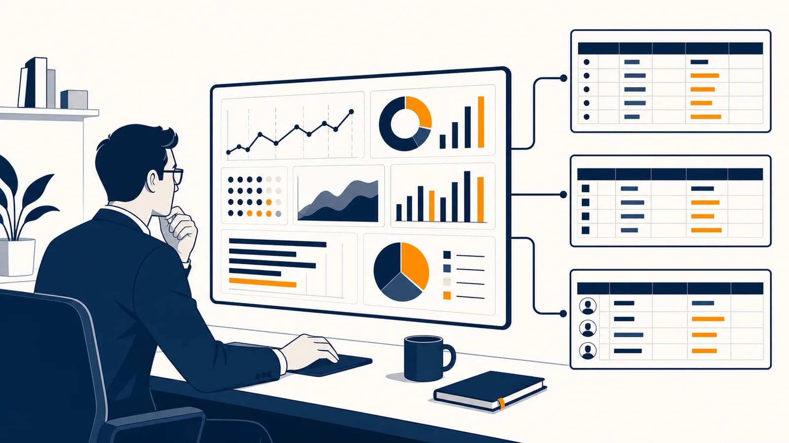
Data analytics and business intelligence is a business discipline that turns recorded facts into evidence for decisions, in the context of organizations, markets, and operations. Data analytics examines data to explain patterns, test ideas, and estimate outcomes, while business intelligence organizes results into reports, metrics, and dashboards that people can use repeatedly. The field exists because a company cannot learn reliably from thousands of sales, payments, deliveries, or customer actions by memory alone. It creates a traceable route from an event to a decision.
What data analytics and business intelligence actually is
Data analytics is the work of asking and answering questions with data, while business intelligence, often called BI, is the system that delivers trusted information to decision makers. Together they convert operational records into measures, explanations, forecasts, and monitored actions.
The raw material is usually a record of an event. A checkout system records that an item sold. A warehouse scanner records that a parcel moved. A website records that a visitor opened a product page. Payroll software records hours and pay. Each record describes only a small event, but many records can reveal a pattern that no employee could observe directly.
An analyst might ask why returns increased, which products are often bought together, or which delivery stage causes delays. The answer could be a table, a statistical estimate, a chart, or a recommendation. A BI system then makes a stable version of useful answers available through scheduled reports and dashboards. A sales manager might see revenue by region each morning, while an operations manager sees late orders by warehouse.
Starts with a question, investigates data, tests explanations, and may produce a one-time finding or model.
Creates repeatable definitions, data pipelines, reports, and dashboards so an organization can monitor known questions consistently.
The boundary is not rigid. The same employee may investigate a sudden drop in orders on Monday and maintain the weekly sales dashboard on Tuesday. Both activities belong to Business because they connect evidence to choices about customers, money, people, and processes.
How the data pipeline works
A data pipeline collects records from source systems, checks and reshapes them, stores them in a useful structure, and presents them for analysis. Every stage can change the answer, so analysts must know where each field came from and what happened to it.
Suppose a café chain wants to know which locations waste the most food. Its till records items sold, its inventory system records ingredients received, and staff record discarded food. Those sources may identify locations differently. One system might use store number 014, another might use a street name, and a third might contain spelling errors. The records cannot be compared safely until those identifiers are matched.
State the decision first. “Which locations need a new ordering rule?” is more useful than “What does the inventory data say?”
Locate the transactions, timestamps, product codes, quantities, and other fields that describe the events behind the question.
Correct formats, join identifiers, handle missing values, remove invalid duplicates, and check totals against a known source.
Arrange the records around business entities such as orders, customers, stores, and dates, then apply agreed metric definitions.
Compare groups, inspect change over time, test possible causes, and show the result with enough context for action.
Check whether the chosen action changed the metric and watch for broken feeds, delayed records, or changed definitions.
Many organizations describe the middle stages as ETL, meaning extract, transform, and load. Others use ELT, meaning extract, load, and then transform inside a data warehouse. The order differs, but the responsibility does not: every transformation needs a reason, and the resulting data needs a clear meaning.
A clean chart can still carry dirty data. If returned orders are counted as completed sales, better colors and sharper labels will not repair the revenue figure.
Validation links the final number back to reality. Analysts compare row counts before and after a join, check that order identifiers remain unique, inspect impossible dates, and reconcile totals with the accounting or source system. A useful pipeline is not simply automated. It is observable enough that someone notices when it fails.
How a business question becomes a metric
A metric is a defined calculation used to represent part of business performance. Turning a question into a metric requires a precise numerator, denominator, time period, population, and treatment of exceptions, because ordinary words such as customer or sale can hide several meanings.
Consider the question, “Are customers returning?” It could mean returning to the website, placing a second order, renewing a contract, or visiting a physical shop again. It could refer to all buyers ever recorded or only buyers whose first purchase occurred in a selected month. Until those choices are explicit, two accurate calculations can disagree.
Dimensions describe the groups
A dimension is a descriptive field used to sort, filter, or group records. Date, product, store, customer type, and sales channel are common dimensions. If total revenue is a measure, revenue by month or by store uses dimensions to expose structure inside that total.
Measures perform the arithmetic
A measure is a numeric calculation such as units sold, average delivery time, gross profit, or return rate. Good measure definitions state their units and rules. They say if tax is included, how cancellations are treated, which timezone sets the day boundary, and how missing records are handled.
If 18 of 600 delivered orders are returned, the rate is .
The denominator matters. Dividing returns by orders placed instead of orders delivered would include cancelled or undelivered orders that never had a chance to be returned. The calculation might still look reasonable, but it would answer a different question.
Granularity controls what one row means
Granularity is the level of detail represented by each record. An order table might contain one row per order, while an order-line table contains one row per product within an order. Joining them carelessly can duplicate the order total. If one order has four product lines, its total can appear four times after the join.
Data analytics versus reporting
Reporting describes selected facts in a repeatable format, while analytics investigates relationships, causes, and possible outcomes. A report can show that sales fell; analysis asks where the fall occurred, what changed beforehand, which explanation fits the evidence, and what action to test.
A weekly report might list orders, revenue, refunds, and advertising cost. It answers a known set of questions in the same way each week. If revenue falls, an analyst can divide the result by product, region, customer type, and channel. The analyst might then compare price changes, stock availability, website errors, and campaign timing. This process turns an alert into a diagnosis.
| Question type | Question | Typical method | Useful output |
|---|---|---|---|
| Descriptive | What happened? | Totals, rates, trends, and group comparisons | A report or dashboard |
| Diagnostic | Why did it happen? | Segmentation, drill-down, and cause checks | An explanation with evidence |
| Predictive | What may happen next? | Forecasting or statistical modeling | An estimate with uncertainty |
| Prescriptive | What should be done? | Constraints, scenarios, experiments, and optimization | A recommended action and tradeoff |
These types form a useful progression, but they are not a ladder that every task must climb. A reliable descriptive answer can be more valuable than a weak forecast. A forecast of next month’s demand also needs descriptive data about past demand and diagnostic work on unusual events.
Reporting also differs from analysis in its audience and timing. Reports are often designed for repeated use by many people. Analysis may begin as an open investigation for one decision. Once an analytical finding becomes routinely useful, it can become a report, monitored metric, or alert.
How dashboards support decisions
A dashboard places a small set of related measures in one view so people can detect change, compare results with targets, and decide where to investigate. It works only when each display has a defined audience, refresh schedule, comparison, and possible response.
A useful dashboard follows the decision. A warehouse supervisor may need today’s unprocessed orders by hour, while a director may need monthly delivery cost and service level by region. Giving both people the same page creates clutter. The supervisor needs operational detail; the director needs a wider pattern and the ability to find exceptions.
The cards above show a checkable calculation, . The percentage is compact, but the counts keep it honest. A 95 percent rate based on 20 orders does not carry the same information as the same rate based on 1,200 orders.
Context makes a chart interpretable. A line needs a time unit. A rate needs its population. A total needs a currency or physical unit. Actual performance often needs a target or previous period beside it. Filters should be visible, especially if a viewer could mistake one region for the whole company.
Color should add meaning, not carry meaning alone. Labels make the example readable for someone who cannot distinguish the colors. The red bar signals an exception, while its text gives the actual quantity. For work on queues, defects, and delivery stages, the methods of improving operations and business processes show how a monitored measure can lead to a changed process.
How analytics shows up in real business settings
Analytics appears wherever repeated events create records and managers must choose among alternatives. Retailers study baskets and returns, manufacturers monitor defects, banks inspect risk, employers examine hiring processes, and logistics teams compare routes, inventory levels, and delivery times.
Retail joins customer actions to product decisions
A retailer can compare views, cart additions, purchases, and returns by product. A product with many views but few purchases may have an unclear description, an unattractive price, or the wrong audience. The data identifies where the problem appears, but further evidence is needed to distinguish those explanations.
Online stores can observe a detailed sequence of customer actions, which makes online retail systems and e-commerce decisions a common setting for funnel analysis. A funnel counts how many eligible users reach each defined stage. Its value comes from finding a stage where behavior changes, not from assuming every person should complete every stage.
A shop records 2,000 product-page visits, 500 cart additions, and 200 completed orders. The visit-to-cart rate is . The cart-to-order rate is . These rates locate loss at different stages, but they do not prove why visitors left.
The shop could inspect page errors, shipping charges, stock messages, device type, and traffic source. It should also check whether repeat visits or blocked tracking caused the same person to be counted differently across stages. A funnel is a model of a process, so its stage definitions must match how the process actually behaves.
Supply chains turn movement into measurable service
A distributor combines purchase orders, warehouse scans, vehicle events, and customer receipts. Analysts measure lead time, late delivery, fill rate, and stockouts. When a delay increases, they separate supplier delay, warehouse waiting, and transport time. That separation matters because each cause belongs to a different manager and requires a different action.
The related study of how supply chains coordinate inventory and delivery adds constraints that a dashboard alone cannot show, such as storage capacity, minimum order quantities, and uncertain supplier lead times.
People analytics needs special care
An employer might examine hiring stages, training completion, absence, pay, or employee turnover. These records concern people and can shape access to work. Analysts should collect only what has a legitimate purpose, restrict access, document decisions, test for group differences, and leave consequential judgments open to human review.
A pattern is not a permission. If past hiring reflects unequal opportunity, a model trained to imitate past hiring can repeat that inequality. Removing a protected characteristic may not solve the problem because another field, such as location, can act as a proxy. Business value does not cancel legal, ethical, or privacy duties.
How experiments separate correlation from cause
An experiment estimates causal effect by assigning comparable units to different conditions and measuring the resulting difference. Random assignment helps balance other influences, so a change in outcomes can be linked more credibly to the tested action than a simple before-and-after comparison allows.
Suppose an online shop wants to test a clearer delivery message. It randomly shows the existing message to one eligible group and the new message to another. If assignment works and nothing else differs systematically, the difference in purchase rates estimates the message’s effect for the tested population and period.
If 168 of 800 visitors buy with the new message and 144 of 800 buy with the existing message, the observed rates are 21% and 18%, a difference of 3 percentage points.
The result is not the same as a guaranteed three percent increase everywhere. Three percentage points is the arithmetic difference between the observed rates. Sampling variation may produce a difference even if the versions have equal effects. Analysts use confidence intervals or statistical tests to show how much uncertainty remains, and they examine whether assignment, tracking, or stopping rules distorted the comparison.
Observational data can reveal correlation without random assignment. Ice cream sales and sunburn may rise together because hot weather affects both. Neither outcome needs to cause the other. Business data contains similar shared causes: holiday periods can increase advertising, site traffic, and sales at the same time. Credible analysis names plausible alternative explanations and tests them where possible.
Correlation is a clue, not a cause. A relationship can support prediction while still giving the wrong instruction for changing the outcome.
Experiments are not always possible or ethical. A company cannot randomly expose employees to unsafe conditions. It may instead use carefully matched comparisons, phased rollouts, interrupted time series, or natural changes in policy. These methods require stronger assumptions, which should be stated alongside the result.
Five mistakes people make with business data
Most damaging analytics mistakes come from a mismatch between the data, definition, comparison, and decision. Common failures include trusting totals without checking their construction, confusing association with cause, hiding variation in averages, selecting favorable evidence, and ignoring the people represented by records.
1. Counting the wrong unit
Orders, items, customers, sessions, and payments are different units. One customer can place several orders, and one order can contain several items. An analyst who counts rows after joining an order table to an item table may report too many orders. The repair is to state what one row represents and test identifier uniqueness.
2. Comparing groups that had different opportunities
A raw count can mislead when group sizes differ. Ten returns among 100 delivered orders is a 10 percent rate, while twelve returns among 300 delivered orders is a 4 percent rate. The second group has more returns but a lower return rate. Counts describe workload; rates describe frequency relative to opportunity.
3. Letting an average hide the distribution
An average delivery time of two days could describe orders clustered near two days, or a mixture of many one-day deliveries and a few very late ones. The median, percentiles, range, and group breakdown can expose that difference. The right summary depends on the decision, especially if the worst delays harm customers.
4. Treating a selected sample as the whole population
Customer survey respondents may differ from customers who ignore the survey. Website data can exclude people who block tracking. A loyalty program contains members, not all shoppers. A larger sample reduces random noise, but it does not automatically repair selection bias. Analysts must ask who could enter the data and who could not.
5. Optimizing the metric instead of the outcome
If a call center rewards short calls alone, workers may end calls before solving the customer’s problem. The measured number improves while service worsens. A safer set of measures could include resolution, repeat contact, customer feedback, and call time, with clear checks against harmful behavior.
“The dashboard is green, so the business is healthy.”
“The defined measures met their thresholds; now check coverage, side effects, and important outcomes that the dashboard does not measure.”
Metrics change behavior because people respond to targets. That makes measurement part of management, not a neutral window. A useful review asks what behavior the metric encourages, what it leaves invisible, and how someone might improve the number without improving the underlying result.
What tools do analysts use?
Analysts use spreadsheets for accessible calculation, SQL for querying structured databases, programming languages for repeatable analysis, BI platforms for dashboards, and statistical methods for inference. The best tool is the simplest one that handles the data volume, repeatability, collaboration, and risk involved.
A spreadsheet can model a budget, clean a modest table, create a pivot table, and test assumptions visibly. It becomes risky when many copied formulas, hidden cells, and manual updates form an undocumented production process. Versioned code is easier to review and rerun for complex work, while a governed BI tool gives many employees controlled access to shared measures.
SQL expresses questions about tables. An analyst can filter paid orders, join them to customers, group them by month, and calculate totals. Python or R can handle statistical models, unusual transformations, and automated checks. Visualization tools provide interactive filters and scheduled refreshes. None of these tools decides what a customer, completed order, or fair comparison means. That is business reasoning.
Tool skill and analytical skill are different. Fast SQL can return the wrong rows faster. A sound question, a checked definition, and a valid comparison come first.
Access controls also belong in the tool choice. A dashboard should not expose individual pay or medical information simply because the software can display it. Teams separate public measures from restricted records, grant access by job need, and keep logs of sensitive use.
What skills does a business analyst need?
A business analyst needs quantitative reasoning, data handling, domain knowledge, communication, and ethical judgment. The job is to translate a practical decision into a testable question, produce a defensible answer, explain its limits, and help the decision maker observe what happens next.
Quantitative reasoning includes rates, percentages, distributions, uncertainty, and cause. Data handling includes querying, cleaning, joining, validating, and documenting. Domain knowledge reveals which records are meaningful: a late scan may indicate a late parcel, a broken scanner, or a different warehouse routine. Communication connects the result to an action without overstating certainty.
A strong analyst can explain a result at several levels. A manager may need the decision and risk. A data engineer may need the field lineage and refresh logic. A colleague reviewing the work may need formulas, assumptions, and code. Clear writing matters because undocumented analysis cannot be challenged or maintained.
The role names vary. BI analysts often build metrics and dashboards. Data analysts may perform broader investigations. Analytics engineers organize tested data models between raw systems and reports. Data scientists often build predictive or causal models. Business analysts may focus more on processes and requirements. In practice, organizations divide the work differently, so the actual responsibilities matter more than the title.
What can a small business analyze without a data team?
A small business can analyze a few well-defined measures using records it already creates, such as sales, costs, stock, bookings, and repeat purchases. It should begin with one recurring decision, keep definitions stable, check source records, and add complexity only when useful.
A repair shop could track bookings requested, jobs completed, average waiting time, parts delayed, and customers who return with the same fault. A weekly table might reveal that waiting time rises when one category of part is unavailable. The owner can test a stocking change and compare later weeks, while remembering that seasonal demand or staffing may also affect the result.
A bakery makes 80 loaves and sells 68, leaving 12 unsold. Its sell-through rate is . The owner records the same figures by weekday for several weeks, then changes one day’s production cautiously and watches both sell-through and missed sales. One percentage informs a decision, while the paired measures guard against simply producing too little.
Small datasets still need good practice. Record dates consistently, preserve the original entries, note definition changes, and avoid collecting personal information without a clear need. A simple sheet with checked inputs can be more trustworthy than an elaborate dashboard built on uncertain records.
Data literacy improves every business decision
Data literacy means being able to interpret how a business number was produced, what it supports, and where it can mislead. It connects accounting, marketing, finance, operations, and management by making evidence testable rather than treating a chart as an answer.
The habit begins with a short chain of questions. What event created this record? What does one row represent? Which records were included? How was the metric calculated? What comparison makes it meaningful? What alternative explanation fits? What action follows, and which result will show if that action worked?
Those questions also improve ordinary decisions outside formal analysis. A discount sign invites a comparison with the previous price. A news chart demands attention to its scale and population. A workplace target raises questions about incentives. The same reasoning used in analytics belongs across the wider study of business choices.
The takeaway: Trace every important number backward to its records and definition, then trace it forward to the decision it is meant to change. Start with one measure you meet this week and write down its unit, population, time period, comparison, and possible source of error.